Analytics explorer
Trustpilot
2025, 2026
Trustpilot is a global reviews platform that helps people and businesses build trust. While most people know Trustpilot for its consumer-facing review site, there’s a robust B2B product behind the scenes designed to help businesses collect, analyse, and act on their review data.
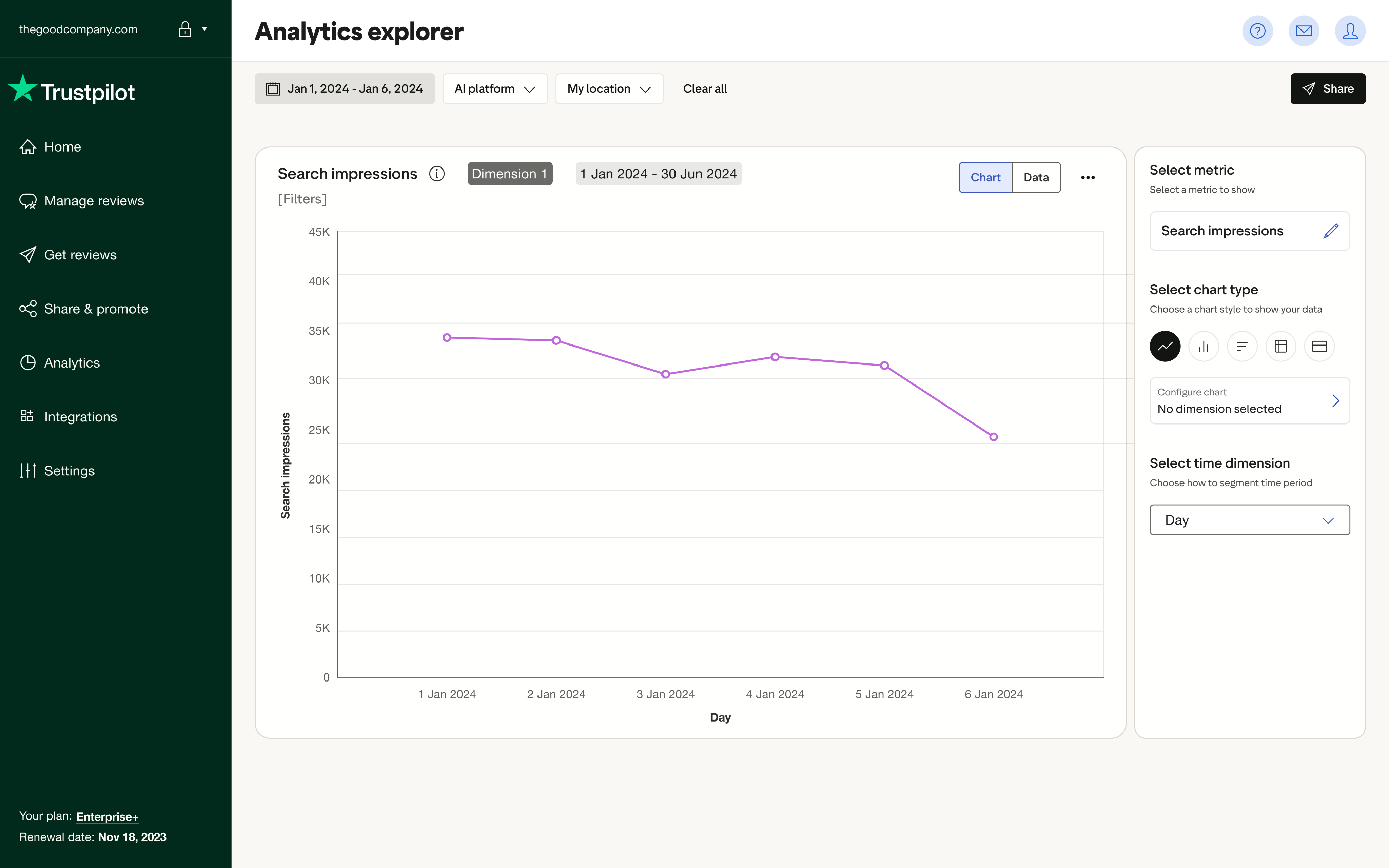
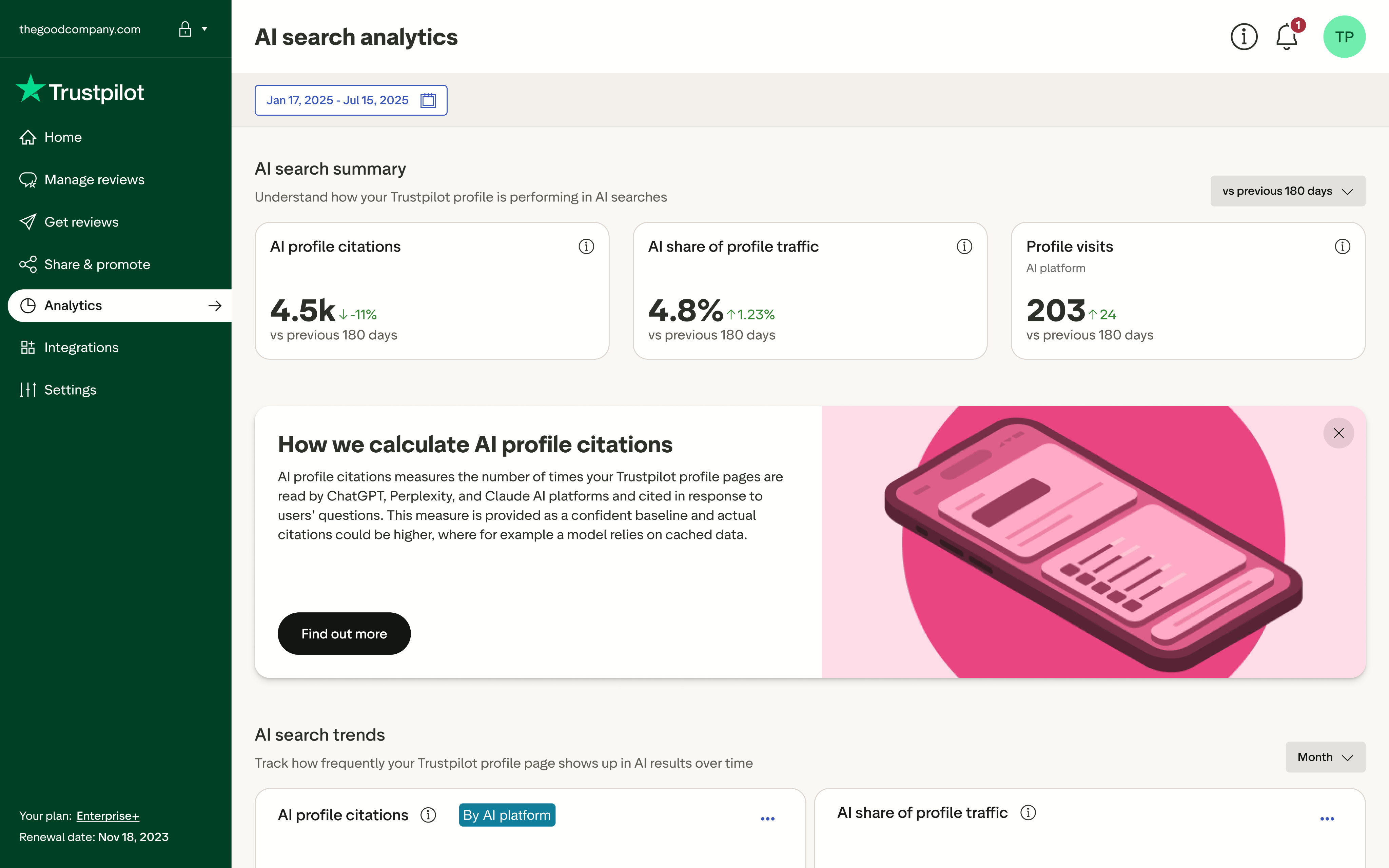
Analytics explorer is Trustpilot’s next-generation analytics experience for mid-market and enterprise clients. It transforms how users discover, compare, and interpret their review performance by introducing flexible charts, guided exploration paths, and contextual insights.
Context
Businesses struggled to make sense of fragmented analytics across our platform. Insights were buried, and exploration felt passive with rigid charts, inconsistent UI patterns, and limited storytelling potential. We needed to build something both powerful and intuitive. A system that helped users see the story behind the scores.
My Role
I led the vision, defined the UX direction, and helped translate strategy into modular design systems. I worked cross-functionally to synthesise user needs, align stakeholders, and shape how analytics would scale across the platform.
Led UX strategy, bringing together product, marketing, and data science
Synthesised user needs via interviews, workshop artefacts, and jobs-to-be-done
Defined the vision and principles for the new analytics paradigm
Created modular components that now serve as the design system foundation for future dashboards
Collaborated with PMs and engineers to align on delivery across squads
The challenge
This project required navigating unclear user maturity levels, legacy technical limitations, fragmented UX patterns, and delivery pressure– all while pushing toward a future-proof foundation.
Unclear expectations around analytics maturity
Users ranged from novice marketing managers to data-savvy analysts, making it difficult to design for one unified level of complexity.
Legacy architecture constraints
The backend structure limited what we could expose or compare, which meant frequent trade-offs between UX ambition and data feasibility.
Time pressure vs craft
We had to deliver something meaningful fast, while laying a foundation for the long term without over-indexing on short-term quick fixes.
Fragmented UX patterns across dashboards
Inconsistent interaction models and visual treatments made it harder to establish trust in the data.
Approach
I started by listening to users, their friction points and what was missing for them. From these signals, I shaped design principles rooted in clarity and intent. The solution emerged as a modular system of chart-led, reusable components built to scale across analytics. Every interaction was crafted to reveal meaning and surface data. A solution that was designed to serve users at every level of fluency, and to bring trust back to the numbers.
We wanted to empower users to explore data with confidence and clarity by creating a modular, insight-led analytics experience that invites discovery, builds trust in the numbers, and scales across use cases.
Design
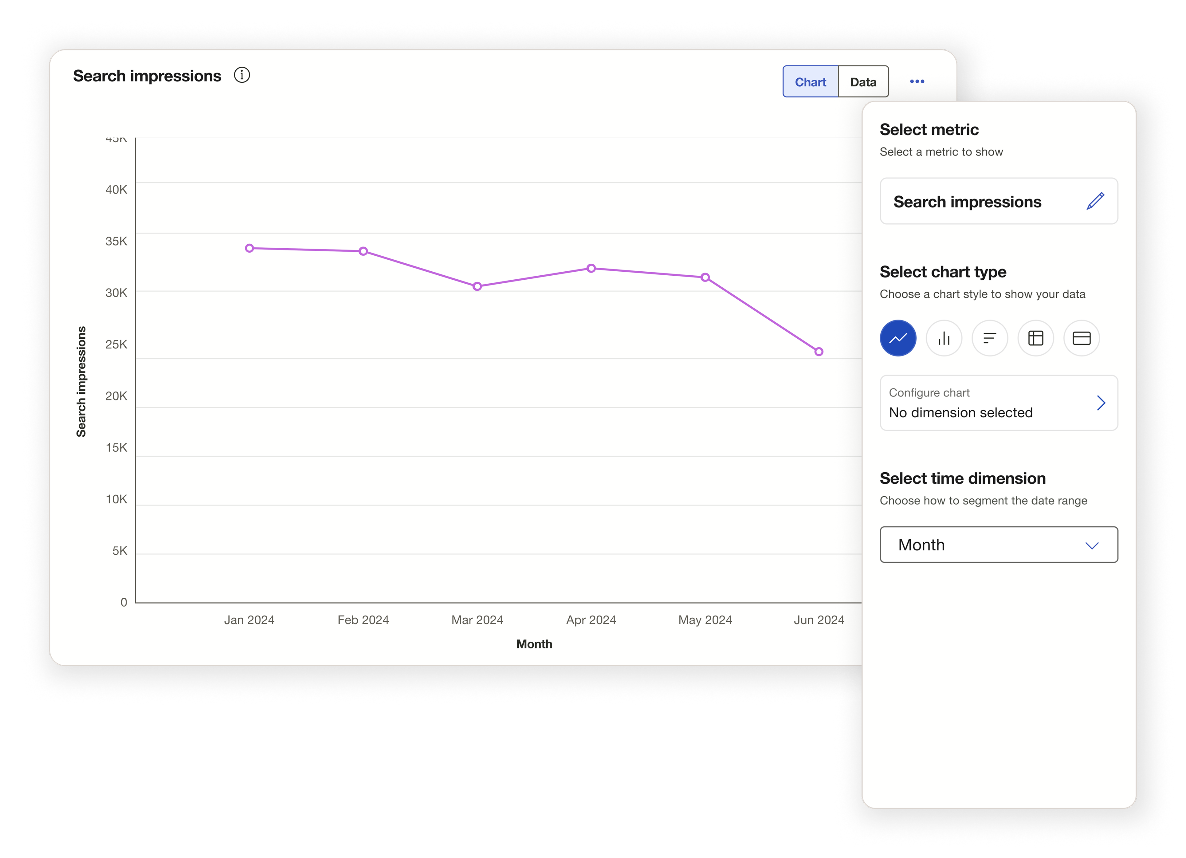
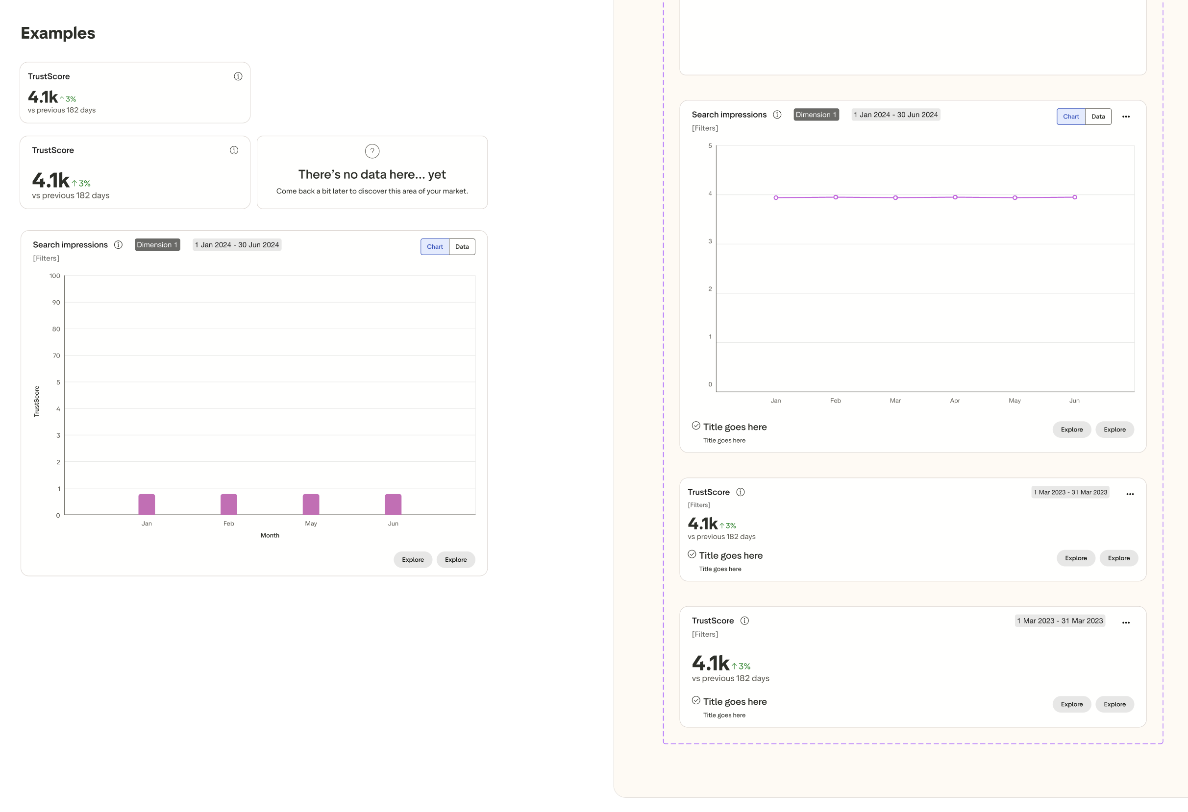
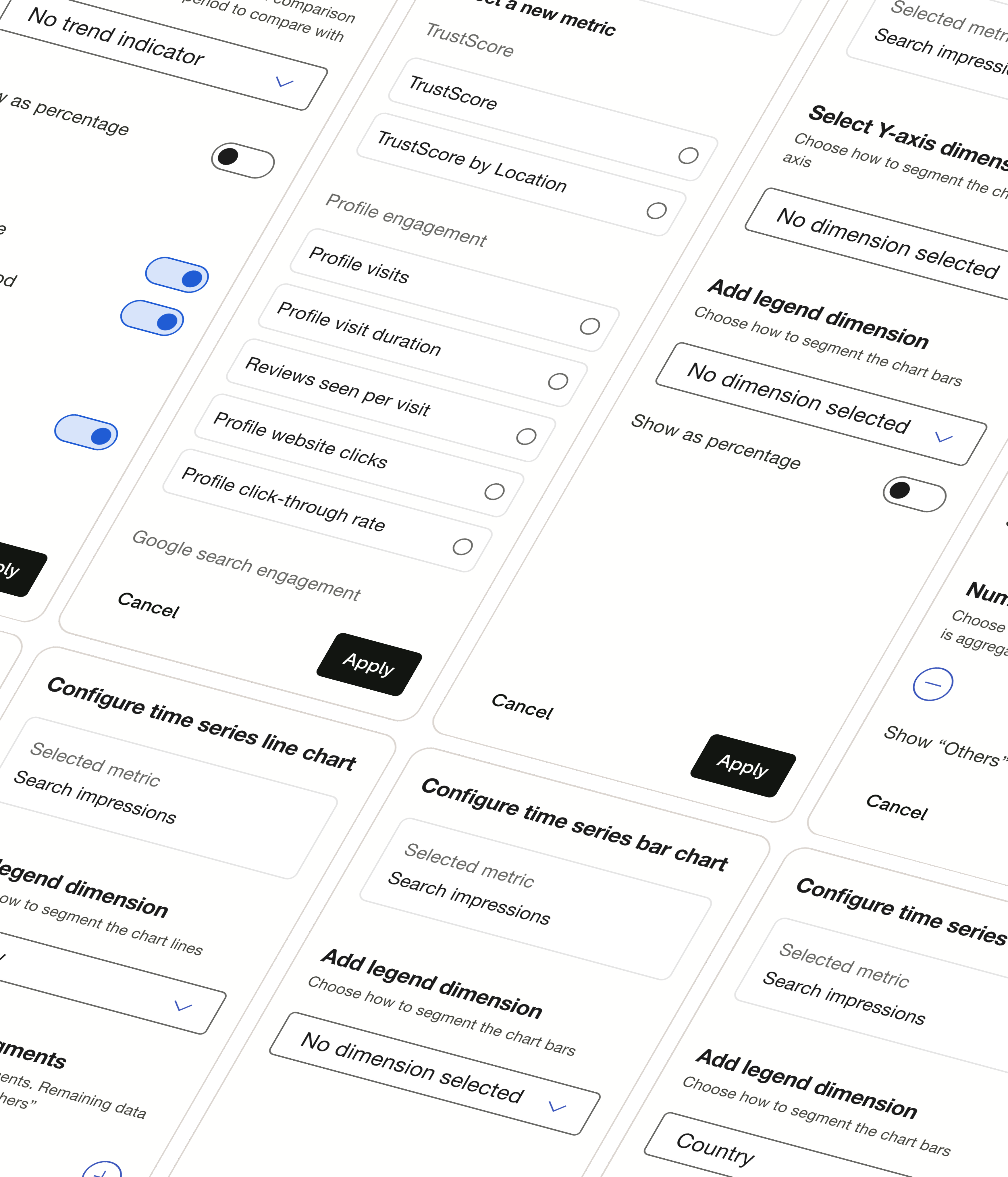
I introduced a modular, scalable interface system centred around visual storytelling and chart-driven interaction. The design supported both novice and advanced users while unifying patterns across the analytics ecosystem.
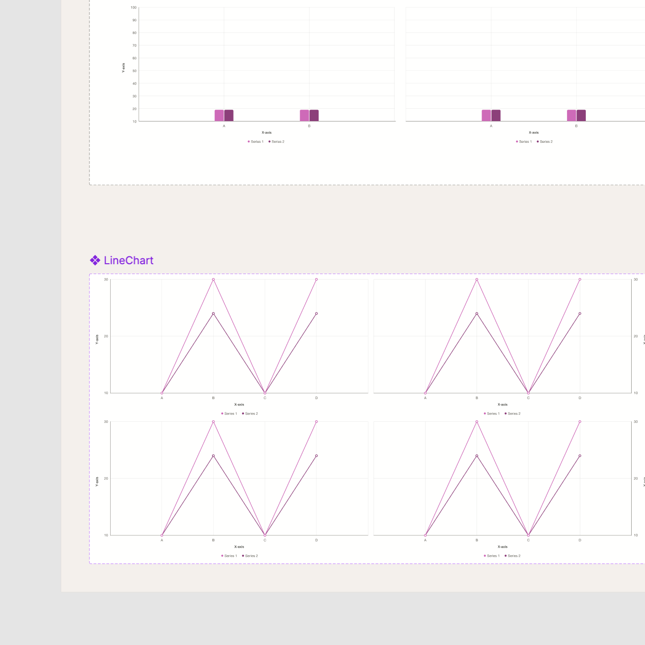
A flexible, chart-first layout that prioritised storytelling and comparison.
A progressive disclosure model to support users across maturity levels.
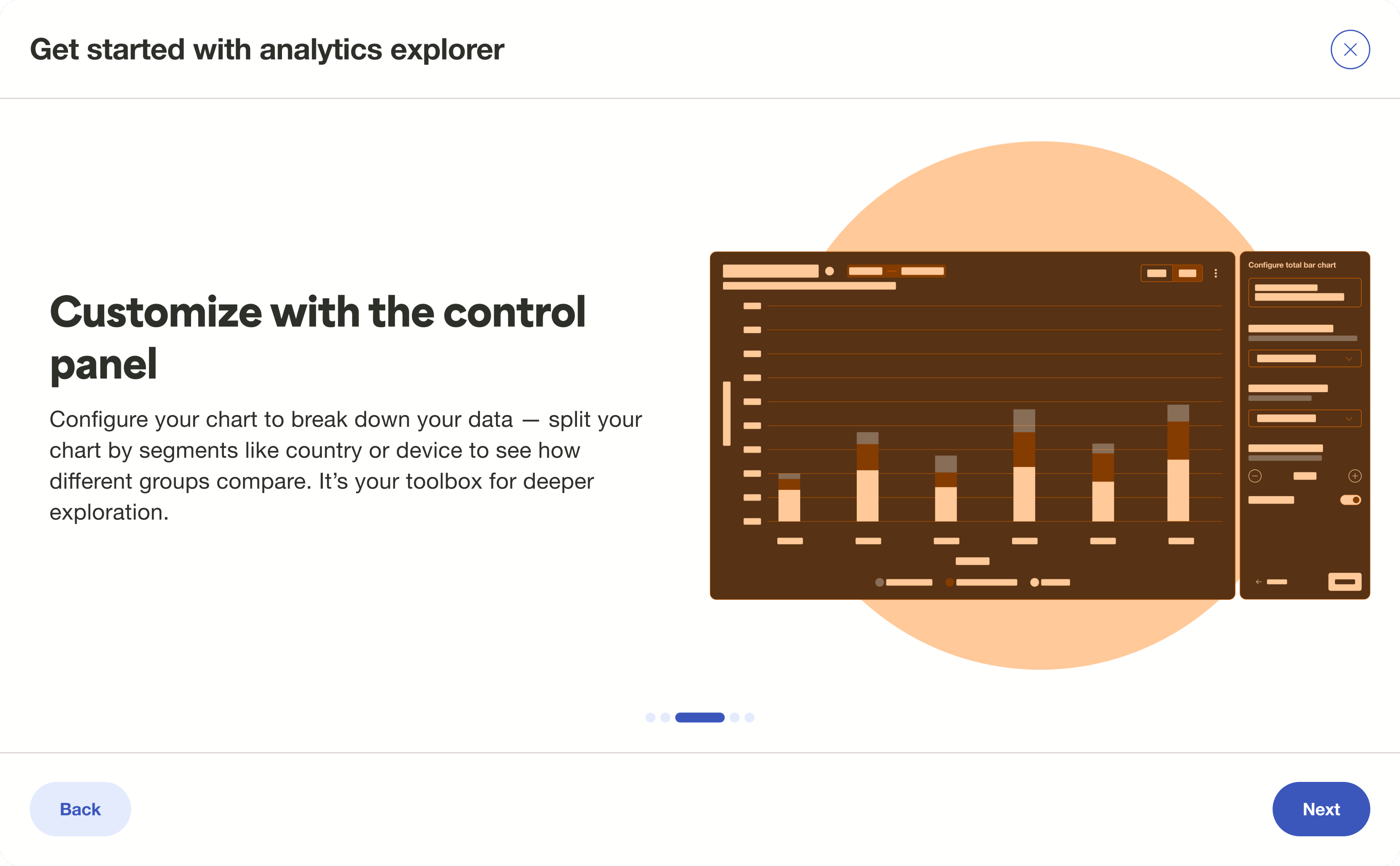
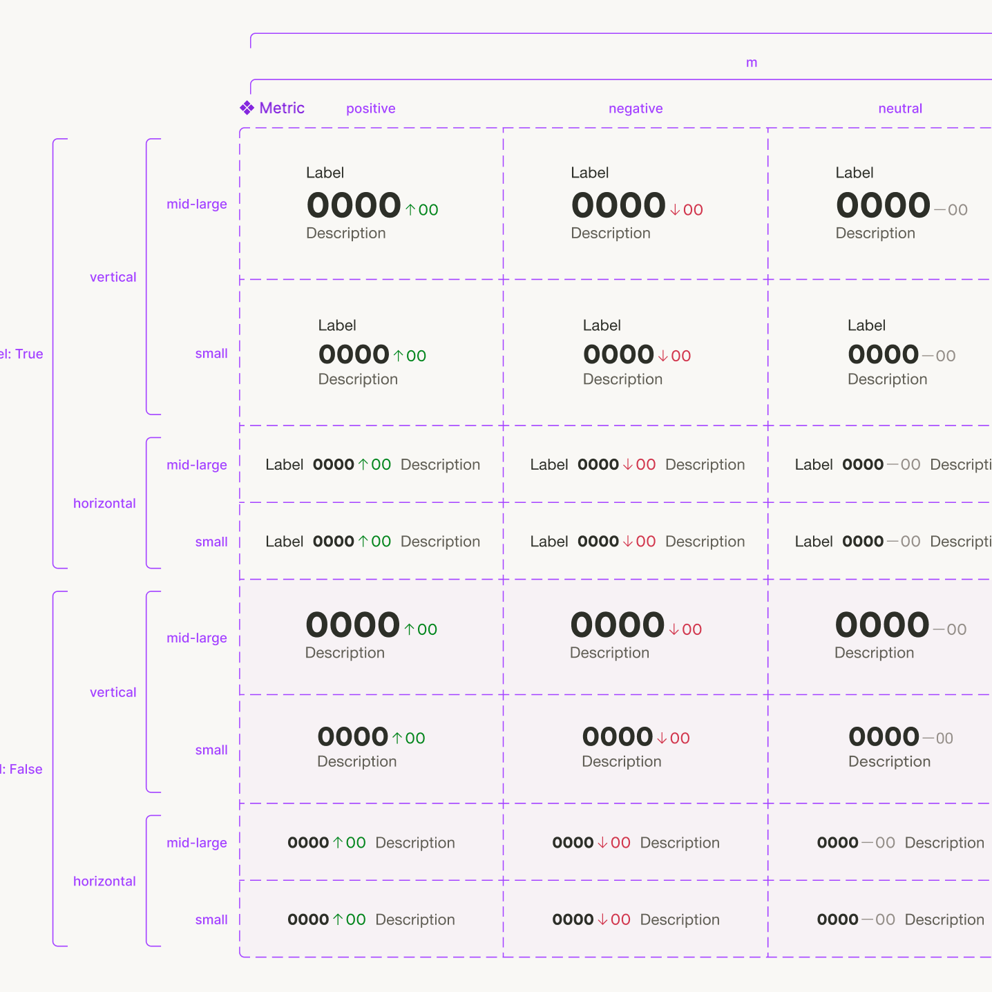
Deconstructable components (charts, filters, context cards, control panels) for cross-dashboard reuse.
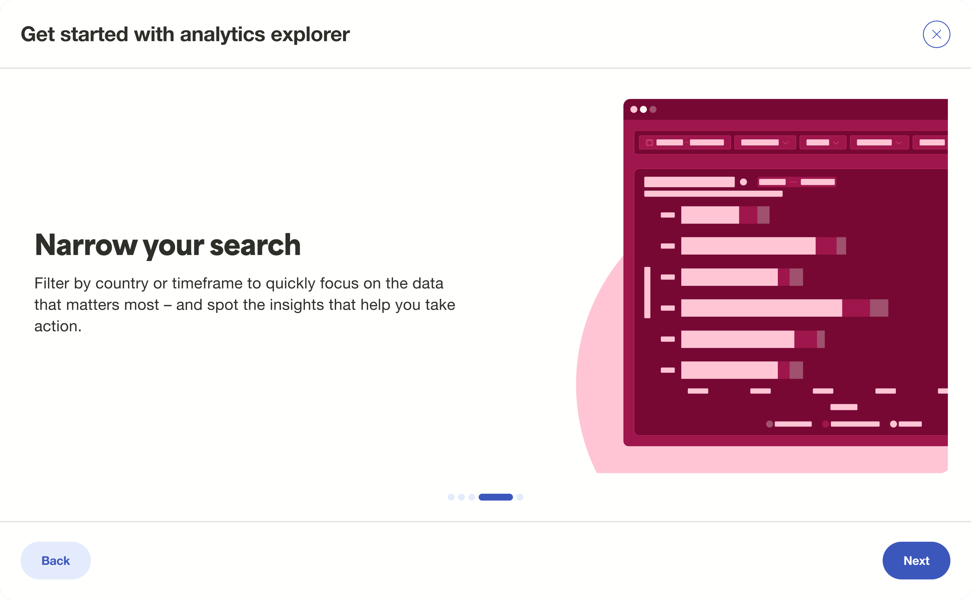
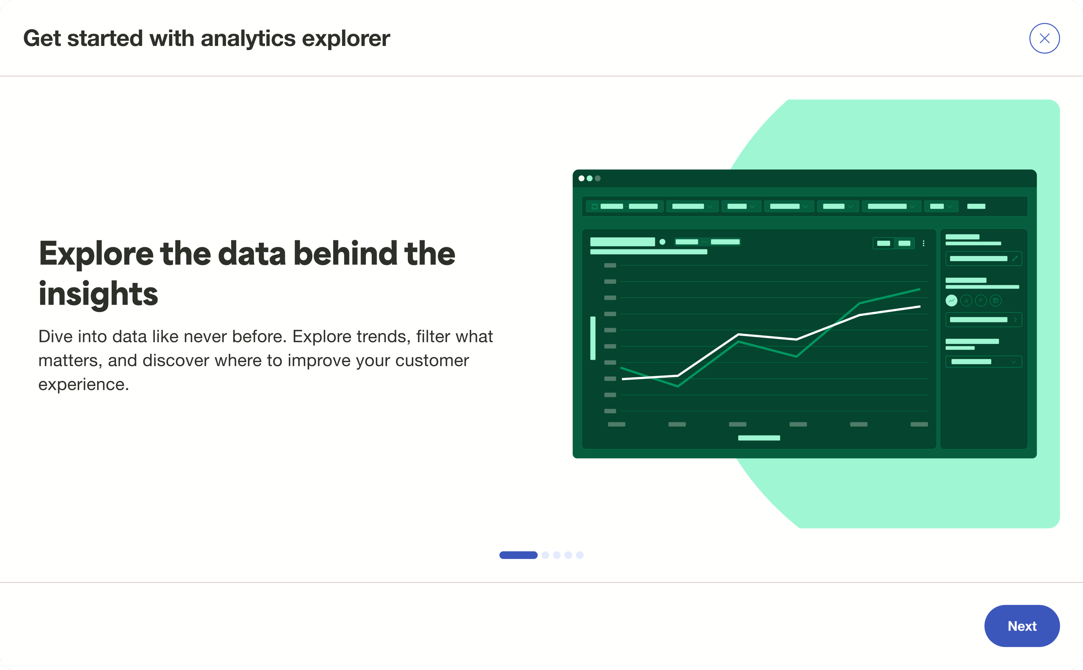
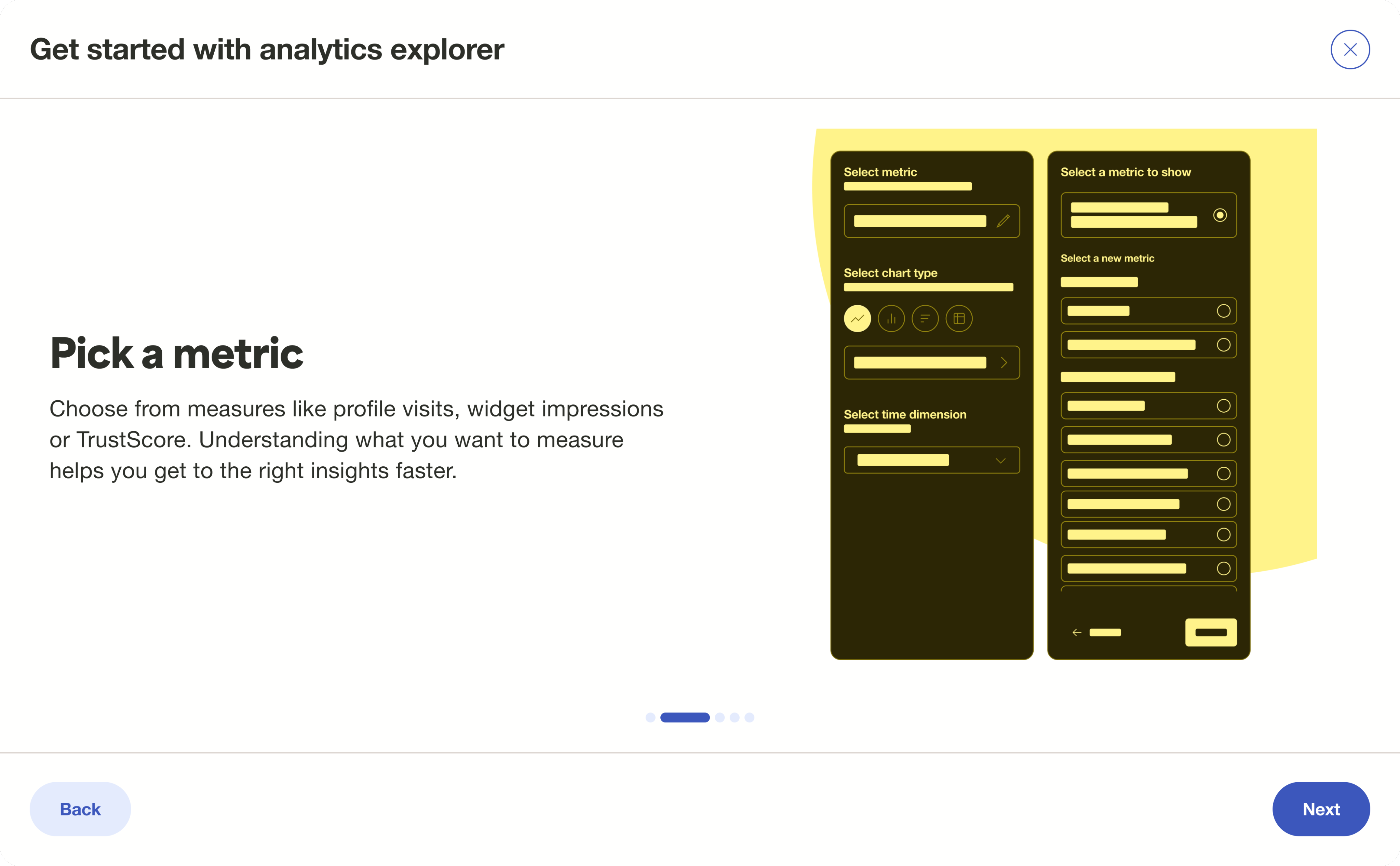
Onboarding flows that guide users through unfamiliar analytics terrain.
Visual design grounded in clarity, hierarchy, and Trustpilot’s new analytics style.
Design principles
At the heart of this project were a few core beliefs. They shaped every decision, from layout to interaction.
Clarity over complexity
Data is only useful if it is understood. We stripped back the noise, used consistent visual language, and let the story emerge through structure, not spectacle.

Modularity with meaning
We built components that could be reused, rearranged, and repurposed. Not just to scale the system but to make the experience feel seamless across use cases.

Guide without obstructing
From onboarding flows to microinteractions, every cue was designed to support the user’s flow. Help was offered contextually, never forced.

Flexibility for the fluent and the first timer
Whether you were a seasoned analyst or a brand manager just logging in, the system flexed to meet you. Progressive disclosure made depth optional, not overwhelming.

Trust is a design outcome
Inconsistent patterns erode confidence. We paid close attention to alignment, data integrity, and visual harmony to ensure that what users saw, they believed and acted on.
Impact
Shipped to enterprise users in Q2 2025 with overwhelmingly positive internal feedback.
30% increase in time-on-insights interactions compared to legacy dashboards.
25.3% activation rate in Q2 2025 (9.3% above target).
CSAT score of 4.2/5 in Q2 2025 (0.2 above target).
Established the design foundation for other key features like visitor insights and custom dashboards.
Inspired a company-wide uplift in analytics craft through shared components and IA models.
Where clarity begins, momentum follows.
This project was as much about restoring clarity where there was noise as it was about visualising data. We set out to create a space where businesses could pause, see patterns, and act with confidence. In designing for exploration, we uncovered a way to make data feel human again by making it legible, layered, and full of possibility.
Trustpilot
2025, 2026
Analytics explorer
Trustpilot is a global reviews platform that helps people and businesses build trust. While most people know Trustpilot for its consumer-facing review site, there’s a robust B2B product behind the scenes designed to help businesses collect, analyse, and act on their review data.
Analytics explorer is Trustpilot’s next-generation analytics experience for mid-market and enterprise clients. It transforms how users discover, compare, and interpret their review performance by introducing flexible charts, guided exploration paths, and contextual insights.
Context
Businesses struggled to make sense of fragmented analytics across our platform. Insights were buried, and exploration felt passive with rigid charts, inconsistent UI patterns, and limited storytelling potential. We needed to build something both powerful and intuitive. A system that helped users see the story behind the scores.
My Role
I led the vision, defined the UX direction, and helped translate strategy into modular design systems. I worked cross-functionally to synthesise user needs, align stakeholders, and shape how analytics would scale across the platform.
Led UX strategy, bringing together product, marketing, and data science
Synthesised user needs via interviews, workshop artefacts, and jobs-to-be-done
Defined the vision and principles for the new analytics paradigm
Created modular components that now serve as the design system foundation for future dashboards
Collaborated with PMs and engineers to align on delivery across squads
The challenge
This project required navigating unclear user maturity levels, legacy technical limitations, fragmented UX patterns, and delivery pressure– all while pushing toward a future-proof foundation.
Unclear expectations around analytics maturity
Users ranged from novice marketing managers to data-savvy analysts, making it difficult to design for one unified level of complexity.
Legacy architecture constraints
The backend structure limited what we could expose or compare, which meant frequent trade-offs between UX ambition and data feasibility.
Fragmented UX patterns across dashboards
Inconsistent interaction models and visual treatments made it harder to establish trust in the data.
Time pressure vs craft
We had to deliver something meaningful fast, while laying a foundation for the long term without over-indexing on short-term quick fixes.
Approach
I started by listening to users, their friction points and what was missing for them. From these signals, I shaped design principles rooted in clarity and intent. The solution emerged as a modular system of chart-led, reusable components built to scale across analytics. Every interaction was crafted to reveal meaning and surface data. A solution that was designed to serve users at every level of fluency, and to bring trust back to the numbers.
We wanted to empower users to explore data with confidence and clarity by creating a modular, insight-led analytics experience that invites discovery, builds trust in the numbers, and scales across use cases.
Design
I introduced a modular, scalable interface system centred around visual storytelling and chart-driven interaction. The design supported both novice and advanced users while unifying patterns across the analytics ecosystem.
A flexible, chart-first layout that prioritised storytelling and comparison.
A progressive disclosure model to support users across maturity levels.
Deconstructable components (charts, filters, context cards, control panels) for cross-dashboard reuse.
Onboarding flows that guide users through unfamiliar analytics terrain.
Visual design grounded in clarity, hierarchy, and Trustpilot’s new analytics style.
Design principles
At the heart of this project were a few core beliefs. They shaped every decision, from layout to interaction.
Clarity over complexity
Data is only useful if it is understood. We stripped back the noise, used consistent visual language, and let the story emerge through structure, not spectacle.
Modularity with meaning
We built components that could be reused, rearranged, and repurposed. Not just to scale the system but to make the experience feel seamless across use cases.
Guide without obstructing
From onboarding flows to microinteractions, every cue was designed to support the user’s flow. Help was offered contextually, never forced.
Flexibility for the fluent and the first timer
Whether you were a seasoned analyst or a brand manager just logging in, the system flexed to meet you. Progressive disclosure made depth optional, not overwhelming.
Trust is a design outcome
Inconsistent patterns erode confidence. We paid close attention to alignment, data integrity, and visual harmony to ensure that what users saw, they believed and acted on.
Impact
Shipped to enterprise users in Q2 2025 with overwhelmingly positive internal feedback.
30% increase in time-on-insights interactions compared to legacy dashboards.
25.3% activation rate in Q2 2025 (9.3% above target).
CSAT score of 4.2/5 in Q2 2025 (0.2 above target).
Established the design foundation for other key features like visitor insights and custom dashboards.
Inspired a company-wide uplift in analytics craft through shared components and IA models.
Where clarity begins, momentum follows.
This project was as much about restoring clarity where there was noise as it was about visualising data. We set out to create a space where businesses could pause, see patterns, and act with confidence. In designing for exploration, we uncovered a way to make data feel human again by making it legible, layered, and full of possibility.
Trustpilot
2025, 2026
Analytics explorer
Trustpilot is a global reviews platform that helps people and businesses build trust. While most people know Trustpilot for its consumer-facing review site, there’s a robust B2B product behind the scenes designed to help businesses collect, analyse, and act on their review data.
Analytics explorer is Trustpilot’s next-generation analytics experience for mid-market and enterprise clients. It transforms how users discover, compare, and interpret their review performance by introducing flexible charts, guided exploration paths, and contextual insights.
Context
Businesses struggled to make sense of fragmented analytics across our platform. Insights were buried, and exploration felt passive with rigid charts, inconsistent UI patterns, and limited storytelling potential. We needed to build something both powerful and intuitive. A system that helped users see the story behind the scores.
My Role
I led the vision, defined the UX direction, and helped translate strategy into modular design systems. I worked cross-functionally to synthesise user needs, align stakeholders, and shape how analytics would scale across the platform.
Led UX strategy, bringing together product, marketing, and data science
Synthesised user needs via interviews, workshop artefacts, and jobs-to-be-done
Defined the vision and principles for the new analytics paradigm
Created modular components that now serve as the design system foundation for future dashboards
Collaborated with PMs and engineers to align on delivery across squads
The challenge
This project required navigating unclear user maturity levels, legacy technical limitations, fragmented UX patterns, and delivery pressure– all while pushing toward a future-proof foundation.
Unclear expectations around analytics maturity
Users ranged from novice marketing managers to data-savvy analysts, making it difficult to design for one unified level of complexity.
Legacy architecture constraints
The backend structure limited what we could expose or compare, which meant frequent trade-offs between UX ambition and data feasibility.
Fragmented UX patterns across dashboards
Inconsistent interaction models and visual treatments made it harder to establish trust in the data.
Time pressure vs craft
We had to deliver something meaningful fast, while laying a foundation for the long term without over-indexing on short-term quick fixes.
Approach
I started by listening to users, their friction points and what was missing for them. From these signals, I shaped design principles rooted in clarity and intent. The solution emerged as a modular system of chart-led, reusable components built to scale across analytics. Every interaction was crafted to reveal meaning and surface data. A solution that was designed to serve users at every level of fluency, and to bring trust back to the numbers.
We wanted to empower users to explore data with confidence and clarity by creating a modular, insight-led analytics experience that invites discovery, builds trust in the numbers, and scales across use cases.
Design
I introduced a modular, scalable interface system centred around visual storytelling and chart-driven interaction. The design supported both novice and advanced users while unifying patterns across the analytics ecosystem.
A flexible, chart-first layout that prioritised storytelling and comparison.
A progressive disclosure model to support users across maturity levels.
Deconstructable components (charts, filters, context cards, control panels) for cross-dashboard reuse.
Onboarding flows that guide users through unfamiliar analytics terrain.
Visual design grounded in clarity, hierarchy, and Trustpilot’s new analytics style.
Design principles
At the heart of this project were a few core beliefs. They shaped every decision, from layout to interaction.
Clarity over complexity
Data is only useful if it is understood. We stripped back the noise, used consistent visual language, and let the story emerge through structure, not spectacle.
Modularity with meaning
We built components that could be reused, rearranged, and repurposed. Not just to scale the system but to make the experience feel seamless across use cases.
Guide without obstructing
From onboarding flows to microinteractions, every cue was designed to support the user’s flow. Help was offered contextually, never forced.
Flexibility for the fluent and the first timer
Whether you were a seasoned analyst or a brand manager just logging in, the system flexed to meet you. Progressive disclosure made depth optional, not overwhelming.
Trust is a design outcome
Inconsistent patterns erode confidence. We paid close attention to alignment, data integrity, and visual harmony to ensure that what users saw, they believed and acted on.
Impact
Shipped to enterprise users in Q2 2025 with overwhelmingly positive internal feedback.
30% increase in time-on-insights interactions compared to legacy dashboards.
25.3% activation rate in Q2 2025 (9.3% above target).
CSAT score of 4.2/5 in Q2 2025 (0.2 above target).
Established the design foundation for other key features like visitor insights and custom dashboards.
Inspired a company-wide uplift in analytics craft through shared components and IA models.
Where clarity begins, momentum follows.
This project was as much about restoring clarity where there was noise as it was about visualising data. We set out to create a space where businesses could pause, see patterns, and act with confidence. In designing for exploration, we uncovered a way to make data feel human again by making it legible, layered, and full of possibility.