Reporting data
Perkbox
2022
Perkbox is a global employee experience platform that helps businesses attract, engage, and retain talent through rewards, benefits, and wellbeing initiatives. Admin users (typically HR and People teams) use the platform to manage employee engagement, monitor adoption, and measure programme success.
An updated reporting experience that transformed static data into clear, actionable insights helping admin users understand engagement, build trust in their data, and take meaningful action. The redesign reduced manual reporting time for CSMs, improved feature adoption, and strengthened customer retention through a more intuitive, insight-led interface.
Context
Admin users struggled to make sense of fragmented, outdated reports that offered little more than adoption stats. Insights were hidden behind confusing terminology, mismatched data, and static downloads. Reporting felt punitive. A mirror showing what wasn’t working, rather than a guide toward action.
We needed to reimagine it as a dynamic, insight-driven experience that helped admins interpret engagement data, uncover patterns, and take meaningful action reduceing dependency on CSMs.
My Role
I led end-to-end design for the new Insights and Reporting experience, from research to delivery.
Defined user and business goals through interviews and workshops
Led experience strategy, content design, and UI prototyping
Partnered with PMs, data, and engineering to define MVP scope and success measures
Presented vision and prototypes to senior stakeholders
Collaborated with PMs and engineers to align on delivery across squads
The challenge
Reporting had become a pain point for both admins and internal teams. Users found it difficult to extract meaning from dense data and disconnected visuals, while the business spent valuable time compensating for a system that no longer met expectations. What was meant to show success had become a source of frustration.
Outdated or mismatched data sources
Admins often saw figures in the reporting dashboard that didn’t align with internal systems. These discrepancies created confusion and made it hard to rely on reporting for day-to-day decisions.
Confusing, jargon-heavy terminology
Metrics were presented using internal language that didn’t resonate with users. Terms like usage and engagement lacked clear definitions, making it difficult for admins to interpret performance.
No clear next steps from insights
Even when users spotted a trend, there was little guidance on what to do next. Reporting stopped at awareness, offering no onward actions to improve engagement or adoption.
Low data literacy among admin users
Not every admin came from an analytics background. Complex visualisations and dense tables alienated many users who simply wanted a straightforward way to understand how employees were engaging with Perkbox.
High CSM workload for manual reporting
Because admins struggled with the feature, they frequently turned to Customer Success Managers for help. Each CSM spent over 40 hours a month creating custom reports, pulling data manually from different tools.
Inconsistent data across systems
Data presented in Tableau didn’t always match the warehouse, forcing internal teams to reconcile inconsistencies before meetings or quarterly reviews. This slowed down processes and reduced confidence in reporting outputs.
Negative perception driving churn
Reporting often highlighted adoption gaps without context or support, leading admins to assume Perkbox wasn’t performing well. Instead of sparking engagement, the feature unintentionally contributed to customer churn.
Approach
We conducted surveys and interviews with admin users and CSMs to understand frustrations and behaviours, then held a synthesis workshop to form hypotheses.
We believed that standardising metrics across systems would create consistency and make data easier to interpret. Segmenting insights by teams, countries, and timeframes would make reporting more relevant and actionable for admins managing diverse workforces. Finally, by framing reports around wellbeing outcomes rather than adoption rates, we could shift the narrative from performance monitoring to employee impact which encouraged engagement rather than anxiety.
Design
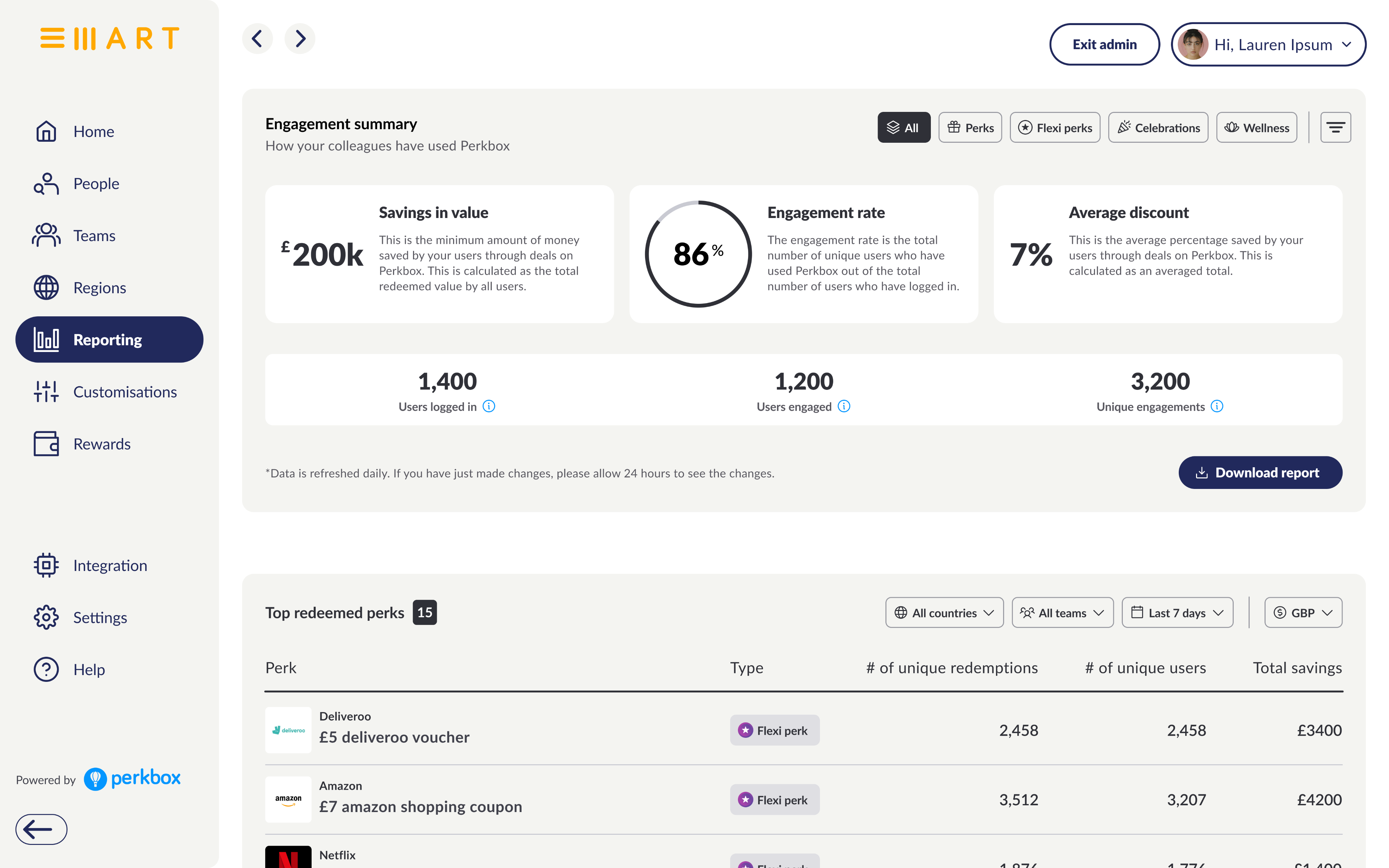
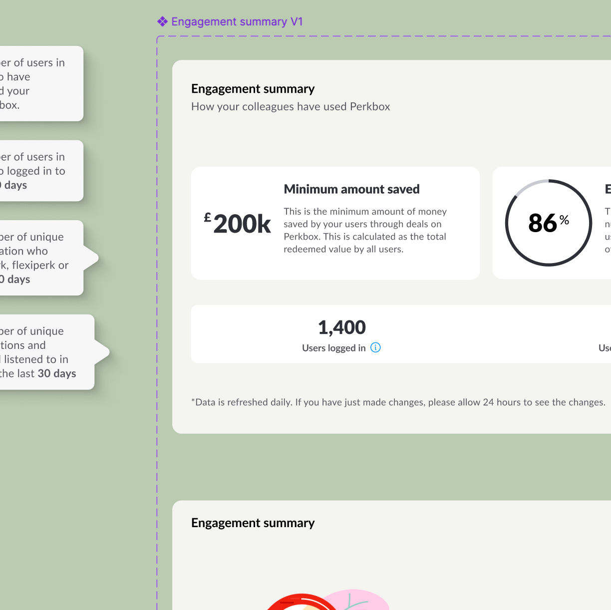
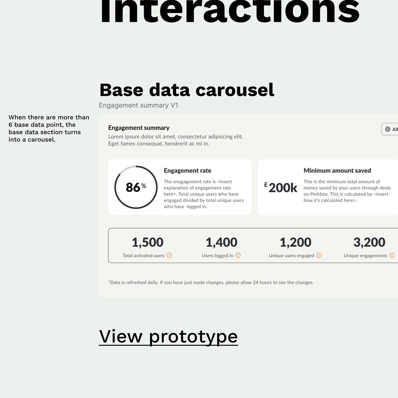
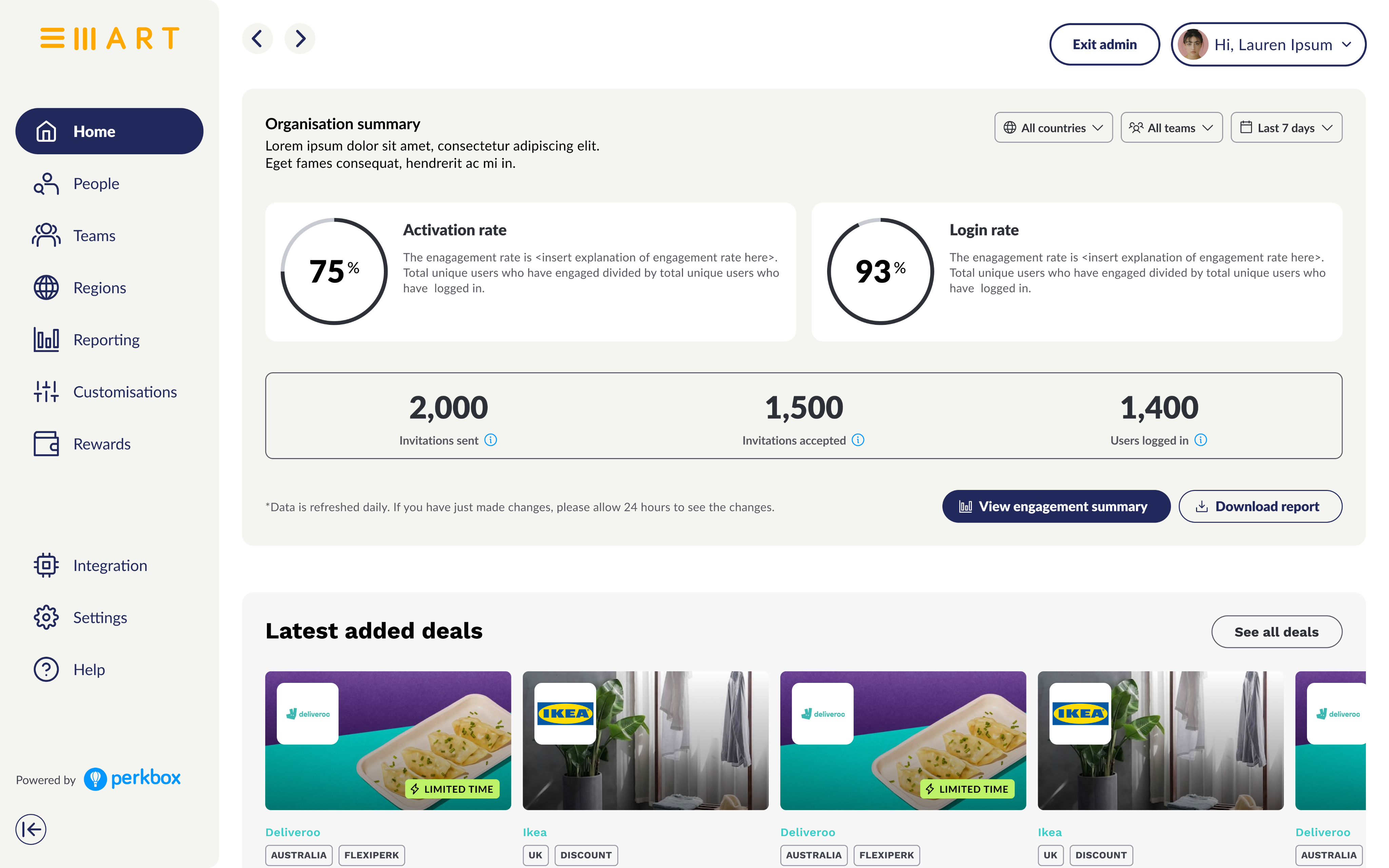
The redesigned Insights and Reporting experience transformed static tables into a living, narrative-driven interface that helps admins interpret engagement data with ease. A new Engagement Summary provides a clear, high-level view of platform activity, while modular insight cards let users explore data by team, country, or timeframe without losing context. Each view is supported by contextual actions, guiding admins toward meaningful next steps such as sharing successes or addressing low engagement areas. By streamlining complex datasets into structured, comparable visuals and enabling effortless report downloads, the design removed friction, empowered independent exploration, and made reporting a tool for understanding rather than upkeep.
Engagement Summary
High-level view of adoption and wellbeing impact
Modular insights cards
Compare metrics by country, team, or timeframe
Contextual CTAs
Suggest next steps and wellbeing actions
Downloadable data visuals
Enable quick sharing and reporting
Single data source
Aligned with the data warehouse for accuracy
Design principles
At the heart of this project were a few core beliefs. They shaped every decision, from layout to interaction.
Clarity over complexity
Plain language, clear hierarchy, and digestible visuals

Trust through consistency
Unified metrics and data sources across the platform

Action over awareness
Every insight drives an onward journey

Design for literacy
Accessible to all, regardless of data fluency
Impact
67% reduction in CSM reporting queries
12% increase in deep engagement (time on page, click-throughs)
8% increase in admin feature adoption
54% rise in monthly admin logins
Redefining reporting as a driver of understanding, not measurement
This project reframed how Perkbox communicates value to its customers like showing adoption data and telling engagement stories. It set the foundation for a more coherent analytics vision across the platform focused on clarity, usability, and meaningful outcomes.
Perkbox
2022
Reporting data
Perkbox is a global employee experience platform that helps businesses attract, engage, and retain talent through rewards, benefits, and wellbeing initiatives. Admin users (typically HR and People teams) use the platform to manage employee engagement, monitor adoption, and measure programme success.
An updated reporting experience that transformed static data into clear, actionable insights helping admin users understand engagement, build trust in their data, and take meaningful action. The redesign reduced manual reporting time for CSMs, improved feature adoption, and strengthened customer retention through a more intuitive, insight-led interface.
Context
Admin users struggled to make sense of fragmented, outdated reports that offered little more than adoption stats. Insights were hidden behind confusing terminology, mismatched data, and static downloads. Reporting felt punitive. A mirror showing what wasn’t working, rather than a guide toward action.
We needed to reimagine it as a dynamic, insight-driven experience that helped admins interpret engagement data, uncover patterns, and take meaningful action reduceing dependency on CSMs.
My Role
I led end-to-end design for the new Insights and Reporting experience, from research to delivery.
Defined user and business goals through interviews and workshops
Led experience strategy, content design, and UI prototyping
Partnered with PMs, data, and engineering to define MVP scope and success measures
Presented vision and prototypes to senior stakeholders
Collaborated with PMs and engineers to align on delivery across squads
The challenge
Reporting had become a pain point for both admins and internal teams. Users found it difficult to extract meaning from dense data and disconnected visuals, while the business spent valuable time compensating for a system that no longer met expectations. What was meant to show success had become a source of frustration.
Outdated or mismatched data sources
Admins often saw figures in the reporting dashboard that didn’t align with internal systems. These discrepancies created confusion and made it hard to rely on reporting for day-to-day decisions.
Confusing, jargon-heavy terminology
Metrics were presented using internal language that didn’t resonate with users. Terms like usage and engagement lacked clear definitions, making it difficult for admins to interpret performance.
No clear next steps from insights
Even when users spotted a trend, there was little guidance on what to do next. Reporting stopped at awareness, offering no onward actions to improve engagement or adoption.
Low data literacy among admin users
Not every admin came from an analytics background. Complex visualisations and dense tables alienated many users who simply wanted a straightforward way to understand how employees were engaging with Perkbox.
High CSM workload for manual reporting
Because admins struggled with the feature, they frequently turned to Customer Success Managers for help. Each CSM spent over 40 hours a month creating custom reports, pulling data manually from different tools.
Inconsistent data across systems
Data presented in Tableau didn’t always match the warehouse, forcing internal teams to reconcile inconsistencies before meetings or quarterly reviews. This slowed down processes and reduced confidence in reporting outputs.
Negative perception driving churn
Reporting often highlighted adoption gaps without context or support, leading admins to assume Perkbox wasn’t performing well. Instead of sparking engagement, the feature unintentionally contributed to customer churn.
Approach
We conducted surveys and interviews with admin users and CSMs to understand frustrations and behaviours, then held a synthesis workshop to form hypotheses.
We believed that standardising metrics across systems would create consistency and make data easier to interpret. Segmenting insights by teams, countries, and timeframes would make reporting more relevant and actionable for admins managing diverse workforces. Finally, by framing reports around wellbeing outcomes rather than adoption rates, we could shift the narrative from performance monitoring to employee impact which encouraged engagement rather than anxiety.
Design
The redesigned Insights and Reporting experience transformed static tables into a living, narrative-driven interface that helps admins interpret engagement data with ease. A new Engagement Summary provides a clear, high-level view of platform activity, while modular insight cards let users explore data by team, country, or timeframe without losing context. Each view is supported by contextual actions, guiding admins toward meaningful next steps such as sharing successes or addressing low engagement areas. By streamlining complex datasets into structured, comparable visuals and enabling effortless report downloads, the design removed friction, empowered independent exploration, and made reporting a tool for understanding rather than upkeep.
Engagement Summary
High-level view of adoption and wellbeing impact
Modular insights cards
Compare metrics by country, team, or timeframe
Contextual CTAs
Suggest next steps and wellbeing actions
Downloadable data visuals
Enable quick sharing and reporting
Single data source
Aligned with the data warehouse for accuracy
Design principles
At the heart of this project were a few core beliefs. They shaped every decision, from layout to interaction.
Clarity over complexity
Plain language, clear hierarchy, and digestible visuals
Trust through consistency
Unified metrics and data sources across the platform
Action over awareness
Every insight drives an onward journey
Design for literacy
Accessible to all, regardless of data fluency
Impact
67% reduction in CSM reporting queries
12% increase in deep engagement (time on page, click-throughs)
8% increase in admin feature adoption
54% rise in monthly admin logins
Redefining reporting as a driver of understanding, not measurement
This project reframed how Perkbox communicates value to its customers like showing adoption data and telling engagement stories. It set the foundation for a more coherent analytics vision across the platform focused on clarity, usability, and meaningful outcomes.
Perkbox
2022
Reporting data
Perkbox is a global employee experience platform that helps businesses attract, engage, and retain talent through rewards, benefits, and wellbeing initiatives. Admin users (typically HR and People teams) use the platform to manage employee engagement, monitor adoption, and measure programme success.
An updated reporting experience that transformed static data into clear, actionable insights helping admin users understand engagement, build trust in their data, and take meaningful action. The redesign reduced manual reporting time for CSMs, improved feature adoption, and strengthened customer retention through a more intuitive, insight-led interface.
Context
Admin users struggled to make sense of fragmented, outdated reports that offered little more than adoption stats. Insights were hidden behind confusing terminology, mismatched data, and static downloads. Reporting felt punitive. A mirror showing what wasn’t working, rather than a guide toward action.
We needed to reimagine it as a dynamic, insight-driven experience that helped admins interpret engagement data, uncover patterns, and take meaningful action reducing dependency on CSMs.
My Role
I led end-to-end design for the new Insights and Reporting experience, from research to delivery.
Defined user and business goals through interviews and workshops
Led experience strategy, content design, and UI prototyping
Partnered with PMs, data, and engineering to define MVP scope and success measures
Presented vision and prototypes to senior stakeholders
Collaborated with PMs and engineers to align on delivery across squads
The challenge
Reporting had become a pain point for both admins and internal teams. Users found it difficult to extract meaning from dense data and disconnected visuals, while the business spent valuable time compensating for a system that no longer met expectations. What was meant to show success had become a source of frustration.
Outdated or mismatched data sources
Admins often saw figures in the reporting dashboard that didn’t align with internal systems. These discrepancies created confusion and made it hard to rely on reporting for day-to-day decisions.
Confusing, jargon-heavy terminology
Metrics were presented using internal language that didn’t resonate with users. Terms like usage and engagement lacked clear definitions, making it difficult for admins to interpret performance.
No clear next steps from insights
Even when users spotted a trend, there was little guidance on what to do next. Reporting stopped at awareness, offering no onward actions to improve engagement or adoption.
Low data literacy among admin users
Not every admin came from an analytics background. Complex visualisations and dense tables alienated many users who simply wanted a straightforward way to understand how employees were engaging with Perkbox.
High CSM workload for manual reporting
Because admins struggled with the feature, they frequently turned to Customer Success Managers for help. Each CSM spent over 40 hours a month creating custom reports, pulling data manually from different tools.
Inconsistent data across systems
Data presented in Tableau didn’t always match the warehouse, forcing internal teams to reconcile inconsistencies before meetings or quarterly reviews. This slowed down processes and reduced confidence in reporting outputs.
Negative perception driving churn
Reporting often highlighted adoption gaps without context or support, leading admins to assume Perkbox wasn’t performing well. Instead of sparking engagement, the feature unintentionally contributed to customer churn.
Approach
We conducted surveys and interviews with admin users and CSMs to understand frustrations and behaviours, then held a synthesis workshop to form hypotheses.
We believed that standardising metrics across systems would create consistency and make data easier to interpret. Segmenting insights by teams, countries, and timeframes would make reporting more relevant and actionable for admins managing diverse workforces. Finally, by framing reports around wellbeing outcomes rather than adoption rates, we could shift the narrative from performance monitoring to employee impact which encouraged engagement rather than anxiety.
Design
The redesigned Insights and Reporting experience transformed static tables into a living, narrative-driven interface that helps admins interpret engagement data with ease. A new Engagement Summary provides a clear, high-level view of platform activity, while modular insight cards let users explore data by team, country, or timeframe without losing context. Each view is supported by contextual actions, guiding admins toward meaningful next steps such as sharing successes or addressing low engagement areas. By streamlining complex datasets into structured, comparable visuals and enabling effortless report downloads, the design removed friction, empowered independent exploration, and made reporting a tool for understanding rather than upkeep.
Engagement Summary
High-level view of adoption and wellbeing impact
Modular insights cards
Compare metrics by country, team, or timeframe
Contextual CTAs
Suggest next steps and wellbeing actions
Downloadable data visuals
Enable quick sharing and reporting
Single data source
Aligned with the data warehouse for accuracy
Design principles
At the heart of this project were a few core beliefs. They shaped every decision, from layout to interaction.
Clarity over complexity
Plain language, clear hierarchy, and digestible visuals
Trust through consistency
Unified metrics and data sources across the platform
Action over awareness
Every insight drives an onward journey
Design for literacy
Accessible to all, regardless of data fluency
Impact
67% reduction in CSM reporting queries
12% increase in deep engagement (time on page, click-throughs)
8% increase in admin feature adoption
54% rise in monthly admin logins
Redefining reporting as a driver of understanding, not measurement
This project reframed how Perkbox communicates value to its customers like showing adoption data and telling engagement stories. It set the foundation for a more coherent analytics vision across the platform focused on clarity, usability, and meaningful outcomes.