Members web app
Gaia
2022
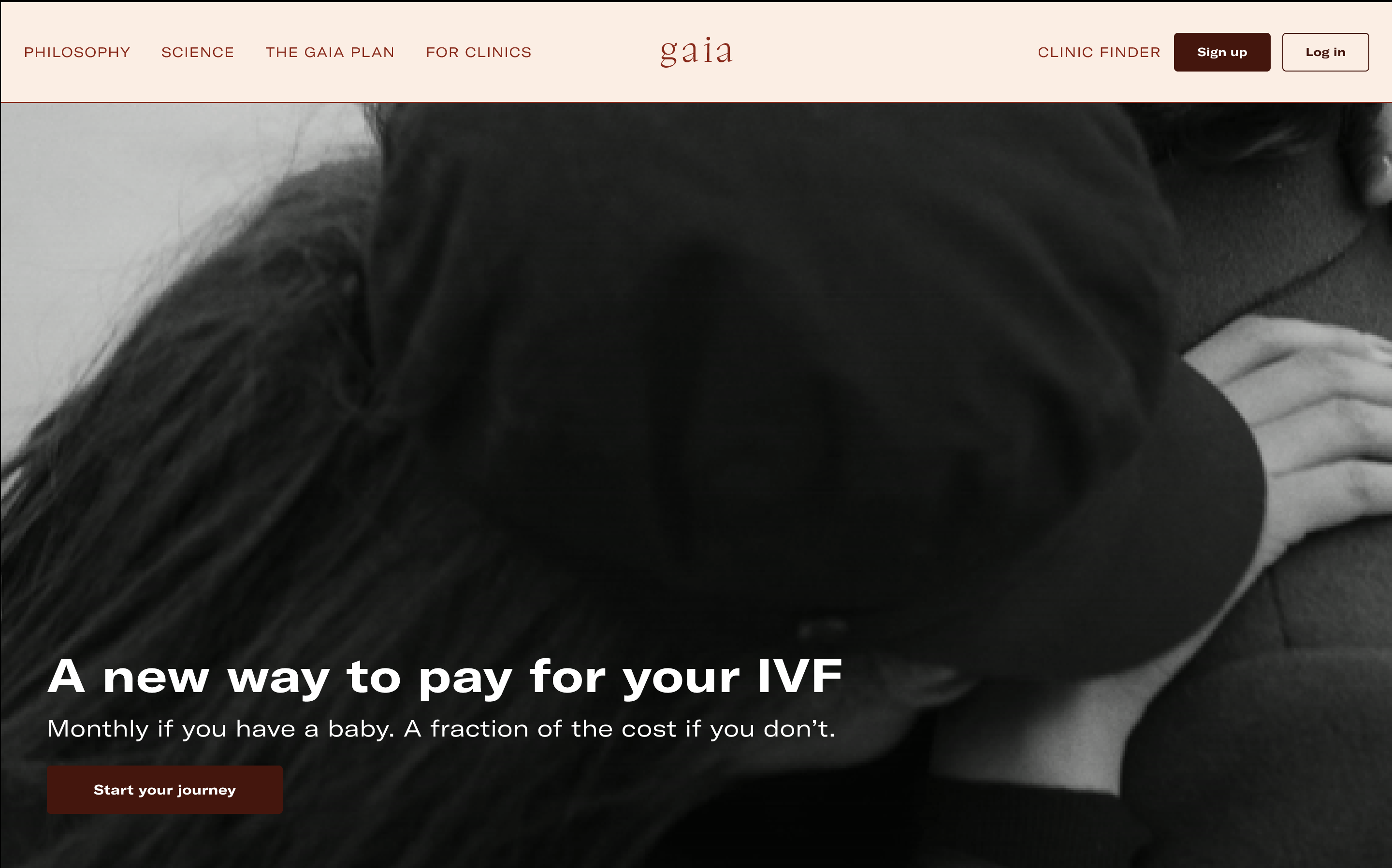
Gaia is an early stage startup that combines reproductive health data with financial technology to make IVF treatments more accessible, affordable and individual. Gaia works with large quantities of complex data around fertility treatments and outcomes to remove ambiguity around success rates. Gaia's first product is an insurance and financing membership redefining access to fertility care, including IVF and egg donation.
The Gaia members’ web app was designed to help users make informed choices while providing a better understanding of their IVF journey.
Context
The original product wasn't delivering on Gaia's core values of insure, finance, and support. A conventional quote-and-bind model was too transactional, too insensitive, and asked too much of users too soon. It was built mobile-last, didn't account for non-linear fertility journeys, excluded LGBTQ+ and single users, and offered no emotional support before pushing a purchase. On top of that, the product hadn't been built with future expansion in mind. As the business grew, the cracks widened.
The challenge was clear: how do we create an inclusive product that delivers real value on a sensitive and emotional journey, regardless of outcome?
My Role
As UX and Design Lead, I owned the end-to-end design process across a fast-moving, cross-functional team. Working alongside a Product Lead and Engineering, I drove the design from research and ideation through to prototyping and delivery, collaborating closely with data, community, insurance, and engineering stakeholders throughout.
Led UX and design end-to-end across the full product lifecycle
Mapped problems and opportunities from user testing and feedback
Designed and iterated on two comprehensive interactive prototypes
Collaborated cross-functionally with data, engineering, and insurance teams
Presented product demos to investors as part of Series A preparation
The challenge
The project sat at the intersection of emotional complexity, technical constraint, and organisational ambiguity. A combination that required careful navigation at every stage.
Scope and time pressure
Across six months, the project touched 8+ distinct workstreams demanding prioritisation, adaptability, and clarity under pressure.
Legacy system complexity
The backend had been built incrementally, with different systems introduced at different points. Integrating these while designing a coherent, future-facing experience required constant trade-offs.
No dedicated product manager
Across six months, the project touched 8+ distinct workstreams — demanding prioritisation, adaptability, and clarity under pressure.
Regulatory and legislative constraints
Beyond user needs, the product had to account for insurance regulations and healthcare guidelines that added a layer of rigour to every design decision.
Stakeholder alignment
Getting internal buy-in across a small but multi-disciplinary team meant continuously advocating for user-centred thinking in a resource-constrained environment.
Approach
The core design hypothesis was that the transaction needed to be separated from the journey. If users could first understand their own path and visualise their timeline, explore clinic options, receive personalised predictions, they would arrive at the point of purchase with confidence rather than anxiety. The product needed to earn trust before it asked for commitment.
Build an ecosystem the user gets value from even when the outcome is negative. Separate the support from the transaction. Let the journey come first.
Design
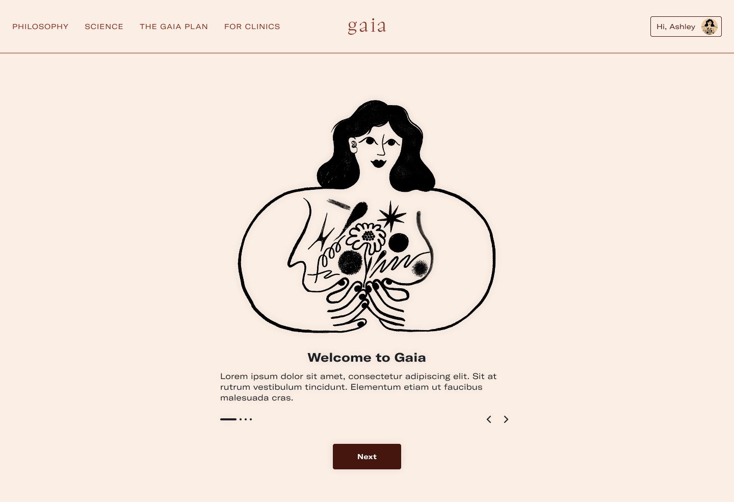
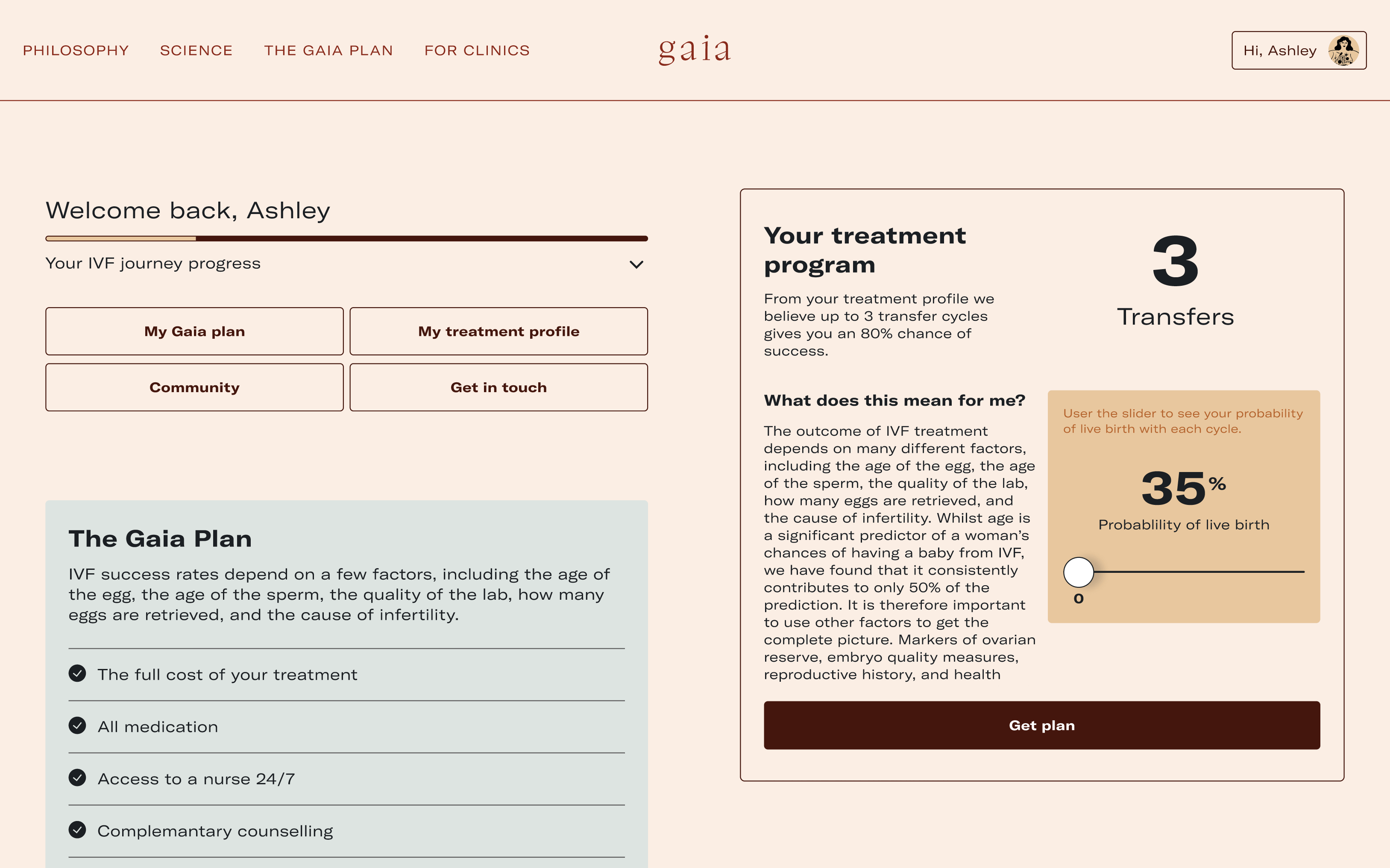
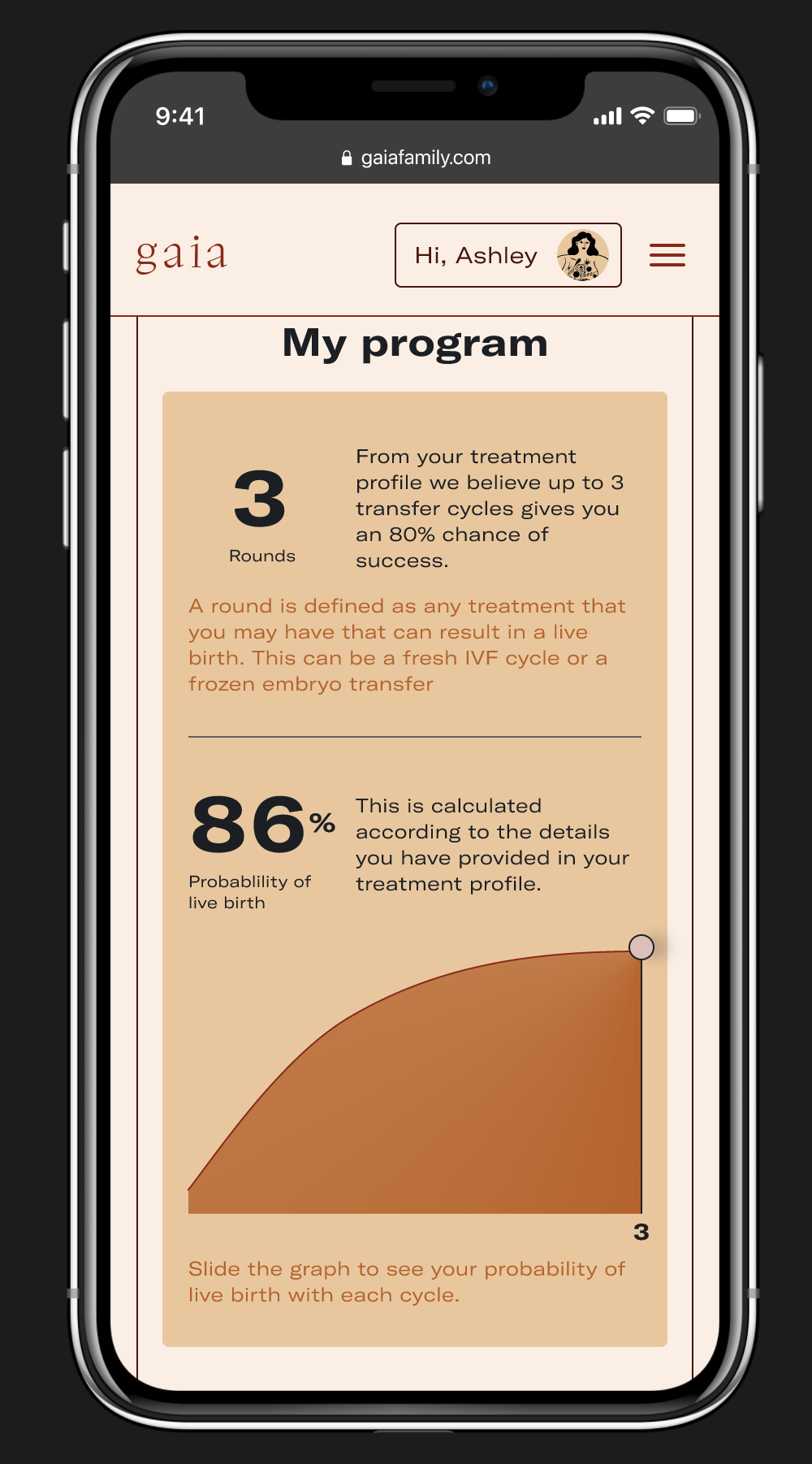
I designed a mobile-first quote-and-bind experience built around reducing friction and emotional fatigue. The product introduced a short, conversational onboarding flow that gathered just enough information to personalise the experience, generating a visual treatment timeline, surfacing relevant clinic comparisons, and positioning insurance as a natural next step rather than the opening ask. The interface was designed to feel warm, grounded, and legible, consistent with Gaia's brand, while functional enough to handle a genuinely complex product.
Start light, go deep
A short, mobile-first onboarding flow with an option to skip ahead
See your journey before you begin
Personalised treatment timeline that visualised the user's IVF journey
Find the right clinic for you
Clinic curation tool to help users compare and shortlist providers
Every path is valid
Inclusive journey design catering for LGBTQ+ users, single people, and non-linear paths
Support first, transaction second
Support-first structure that prioritised community and information before transaction
Design principles
The design was guided by a set of principles that kept human needs at the centre even as the product's complexity grew.
Support before transaction
Users on a fertility journey deserve care before they're asked to commit. The product led with value of information, personalisation, and community before surfacing the financial product.

Inclusivity by design
IVF is not a single, linear journey. The design accounted for the full spectrum of paths like different family structures, different starting points, different outcomes without making anyone feel like an edge case.

Reduce friction, not depth
A shorter journey doesn’t mean a shallower one. We stripped away unnecessary steps while preserving the richness of information users needed to feel informed and confident.

Design for the long game
Every decision was made with future product expansion in mind. Building a foundation flexible enough to accommodate community features, clinic partnerships, and pricing complexity without requiring a rebuild.
Impact
First web app ever shipped for Gaia
Product demo presented to investors, contributing to Series A funding of $20M
6-month project spanning 8+ workstreams
Automated manual processes and strengthened data pipelines across the business
Where clarity begins, trust follows.
This project asked a fundamental question– “What does it mean to design for someone at their most vulnerable?” IVF is a journey full of unknowns– emotionally, medically, financially. The old product met users at the door with paperwork. We set out to meet them with understanding instead. By separating the transaction from the journey, and building an ecosystem that delivered value regardless of outcome, we gave Gaia something more durable than a sign-up flow. We gave it a reason to be trusted.
Gaia
2022
Members web app
Gaia is an early stage startup that combines reproductive health data with financial technology to make IVF treatments more accessible, affordable and individual. Gaia works with large quantities of complex data around fertility treatments and outcomes to remove ambiguity around success rates. Gaia's first product is an insurance and financing membership redefining access to fertility care, including IVF and egg donation.
The Gaia members’ web app was designed to help users make informed choices while providing a better understanding of their IVF journey.
Context
The original product wasn't delivering on Gaia's core values of insure, finance, and support. A conventional quote-and-bind model was too transactional, too insensitive, and asked too much of users too soon. It was built mobile-last, didn't account for non-linear fertility journeys, excluded LGBTQ+ and single users, and offered no emotional support before pushing a purchase. On top of that, the product hadn't been built with future expansion in mind. As the business grew, the cracks widened.
The challenge was clear: how do we create an inclusive product that delivers real value on a sensitive and emotional journey, regardless of outcome?
My Role
As UX and Design Lead, I owned the end-to-end design process across a fast-moving, cross-functional team. Working alongside a Product Lead and Engineering, I drove the design from research and ideation through to prototyping and delivery, collaborating closely with data, community, insurance, and engineering stakeholders throughout.
Led UX and design end-to-end across the full product lifecycle
Mapped problems and opportunities from user testing and feedback
Designed and iterated on two comprehensive interactive prototypes
Collaborated cross-functionally with data, engineering, and insurance teams
Presented product demos to investors as part of Series A preparation
The challenge
The project sat at the intersection of emotional complexity, technical constraint, and organisational ambiguity. A combination that required careful navigation at every stage.
Scope and time pressure
Across six months, the project touched 8+ distinct workstreams demanding prioritisation, adaptability, and clarity under pressure.
Legacy system complexity
The backend had been built incrementally, with different systems introduced at different points. Integrating these while designing a coherent, future-facing experience required constant trade-offs.
No dedicated product manager
Across six months, the project touched 8+ distinct workstreams — demanding prioritisation, adaptability, and clarity under pressure.
Regulatory and legislative constraints
Beyond user needs, the product had to account for insurance regulations and healthcare guidelines that added a layer of rigour to every design decision.
Stakeholder alignment
Getting internal buy-in across a small but multi-disciplinary team meant continuously advocating for user-centred thinking in a resource-constrained environment.
Approach
The core design hypothesis was that the transaction needed to be separated from the journey. If users could first understand their own path and visualise their timeline, explore clinic options, receive personalised predictions, they would arrive at the point of purchase with confidence rather than anxiety. The product needed to earn trust before it asked for commitment.
Build an ecosystem the user gets value from even when the outcome is negative. Separate the support from the transaction. Let the journey come first.
Design
I designed a mobile-first quote-and-bind experience built around reducing friction and emotional fatigue. The product introduced a short, conversational onboarding flow that gathered just enough information to personalise the experience, generating a visual treatment timeline, surfacing relevant clinic comparisons, and positioning insurance as a natural next step rather than the opening ask. The interface was designed to feel warm, grounded, and legible, consistent with Gaia's brand, while functional enough to handle a genuinely complex product.
Start light, go deep
A short, mobile-first onboarding flow with an option to skip ahead
See your journey before you begin
Personalised treatment timeline that visualised the user's IVF journey
Find the right clinic for you
Clinic curation tool to help users compare and shortlist providers
Every path is valid
Inclusive journey design catering for LGBTQ+ users, single people, and non-linear paths
Support first, transaction second
Support-first structure that prioritised community and information before transaction
Design principles
The design was guided by a set of principles that kept human needs at the centre even as the product's complexity grew.
Support before transaction
Users on a fertility journey deserve care before they're asked to commit. The product led with value of information, personalisation, and community before surfacing the financial product.
Inclusivity by design
IVF is not a single, linear journey. The design accounted for the full spectrum of paths like different family structures, different starting points, different outcomes without making anyone feel like an edge case.
Reduce friction, not depth
A shorter journey doesn’t mean a shallower one. We stripped away unnecessary steps while preserving the richness of information users needed to feel informed and confident.
Design for the long game
Every decision was made with future product expansion in mind. Building a foundation flexible enough to accommodate community features, clinic partnerships, and pricing complexity without requiring a rebuild.
Impact
First web app ever shipped for Gaia
Product demo presented to investors, contributing to Series A funding of $20M
6-month project spanning 8+ workstreams
Automated manual processes and strengthened data pipelines across the business
Where clarity begins, trust follows.
This project asked a fundamental question– “What does it mean to design for someone at their most vulnerable?” IVF is a journey full of unknowns– emotionally, medically, financially. The old product met users at the door with paperwork. We set out to meet them with understanding instead. By separating the transaction from the journey, and building an ecosystem that delivered value regardless of outcome, we gave Gaia something more durable than a sign-up flow. We gave it a reason to be trusted.
Gaia
2021
Members web app
Gaia is an early stage startup that combines reproductive health data with financial technology to make IVF treatments more accessible, affordable and individual. Gaia works with large quantities of complex data around fertility treatments and outcomes to remove ambiguity around success rates. Gaia's first product is an insurance and financing membership redefining access to fertility care, including IVF and egg donation.
The Gaia members’ web app was designed to help users make informed choices while providing a better understanding of their IVF journey.
Context
The original product wasn't delivering on Gaia's core values of insure, finance, and support. A conventional quote-and-bind model was too transactional, too insensitive, and asked too much of users too soon. It was built mobile-last, didn't account for non-linear fertility journeys, excluded LGBTQ+ and single users, and offered no emotional support before pushing a purchase. On top of that, the product hadn't been built with future expansion in mind. As the business grew, the cracks widened.
The challenge was clear: how do we create an inclusive product that delivers real value on a sensitive and emotional journey, regardless of outcome?
My Role
As UX and Design Lead, I owned the end-to-end design process across a fast-moving, cross-functional team. Working alongside a Product Lead and Engineering, I drove the design from research and ideation through to prototyping and delivery, collaborating closely with data, community, insurance, and engineering stakeholders throughout.
Led UX and design end-to-end across the full product lifecycle
Mapped problems and opportunities from user testing and feedback
Designed and iterated on two comprehensive interactive prototypes
Collaborated cross-functionally with data, engineering, and insurance teams
Presented product demos to investors as part of Series A preparation
The challenge
The project sat at the intersection of emotional complexity, technical constraint, and organisational ambiguity. A combination that required careful navigation at every stage.
Scope and time pressure
Across six months, the project touched 8+ distinct workstreams demanding prioritisation, adaptability, and clarity under pressure.
Legacy system complexity
The backend had been built incrementally, with different systems introduced at different points. Integrating these while designing a coherent, future-facing experience required constant trade-offs.
No dedicated product manager
Without a PM in place for much of the project, design had to hold both the user-centric and the strategic perspectives simultaneously, bridging UX goals with business direction.
Regulatory and legislative constraints
Beyond user needs, the product had to account for insurance regulations and healthcare guidelines that added a layer of rigour to every design decision.
Stakeholder alignment
Getting internal buy-in across a small but multi-disciplinary team meant continuously advocating for user-centred thinking in a resource-constrained environment.
Approach
The core design hypothesis was that the transaction needed to be separated from the journey. If users could first understand their own path and visualise their timeline, explore clinic options, receive personalised predictions, they would arrive at the point of purchase with confidence rather than anxiety. The product needed to earn trust before it asked for commitment.
Build an ecosystem the user gets value from even when the outcome is negative. Separate the support from the transaction. Let the journey come first.
Design
I designed a mobile-first quote-and-bind experience built around reducing friction and emotional fatigue. The product introduced a short, conversational onboarding flow that gathered just enough information to personalise the experience, generating a visual treatment timeline, surfacing relevant clinic comparisons, and positioning insurance as a natural next step rather than the opening ask. The interface was designed to feel warm, grounded, and legible, consistent with Gaia's brand, while functional enough to handle a genuinely complex product.
Start light, go deep
A short, mobile-first onboarding flow with an option to skip ahead
See your journey before you begin
Personalised treatment timeline that visualised the user's IVF journey
Find the right clinic for you
Clinic curation tool to help users compare and shortlist providers
Every path is valid
Inclusive journey design catering for LGBTQ+ users, single people, and non-linear paths
Support first, transaction second
Support-first structure that prioritised community and information before transaction
Design principles
The design was guided by a set of principles that kept human needs at the centre even as the product's complexity grew.
Support before transaction
Users on a fertility journey deserve care before they're asked to commit. The product led with value of information, personalisation, and community before surfacing the financial product.
Inclusivity by design
IVF is not a single, linear journey. The design accounted for the full spectrum of paths like different family structures, different starting points, different outcomes without making anyone feel like an edge case.
Reduce friction, not depth
A shorter journey doesn’t mean a shallower one. We stripped away unnecessary steps while preserving the richness of information users needed to feel informed and confident.
Design for the long game
Every decision was made with future product expansion in mind. Building a foundation flexible enough to accommodate community features, clinic partnerships, and pricing complexity without requiring a rebuild.
Impact
First web app ever shipped for Gaia
Product demo presented to investors, contributing to Series A funding of $20M
6-month project spanning 8+ workstreams
Automated manual processes and strengthened data pipelines across the business
Where clarity begins, trust follows.
This project asked a fundamental question– “What does it mean to design for someone at their most vulnerable?” IVF is a journey full of unknowns– emotionally, medically, financially. The old product met users at the door with paperwork. We set out to meet them with understanding instead. By separating the transaction from the journey, and building an ecosystem that delivered value regardless of outcome, we gave Gaia something more durable than a sign-up flow. We gave it a reason to be trusted.