Customer onboarding
Feedr
2022, 2023
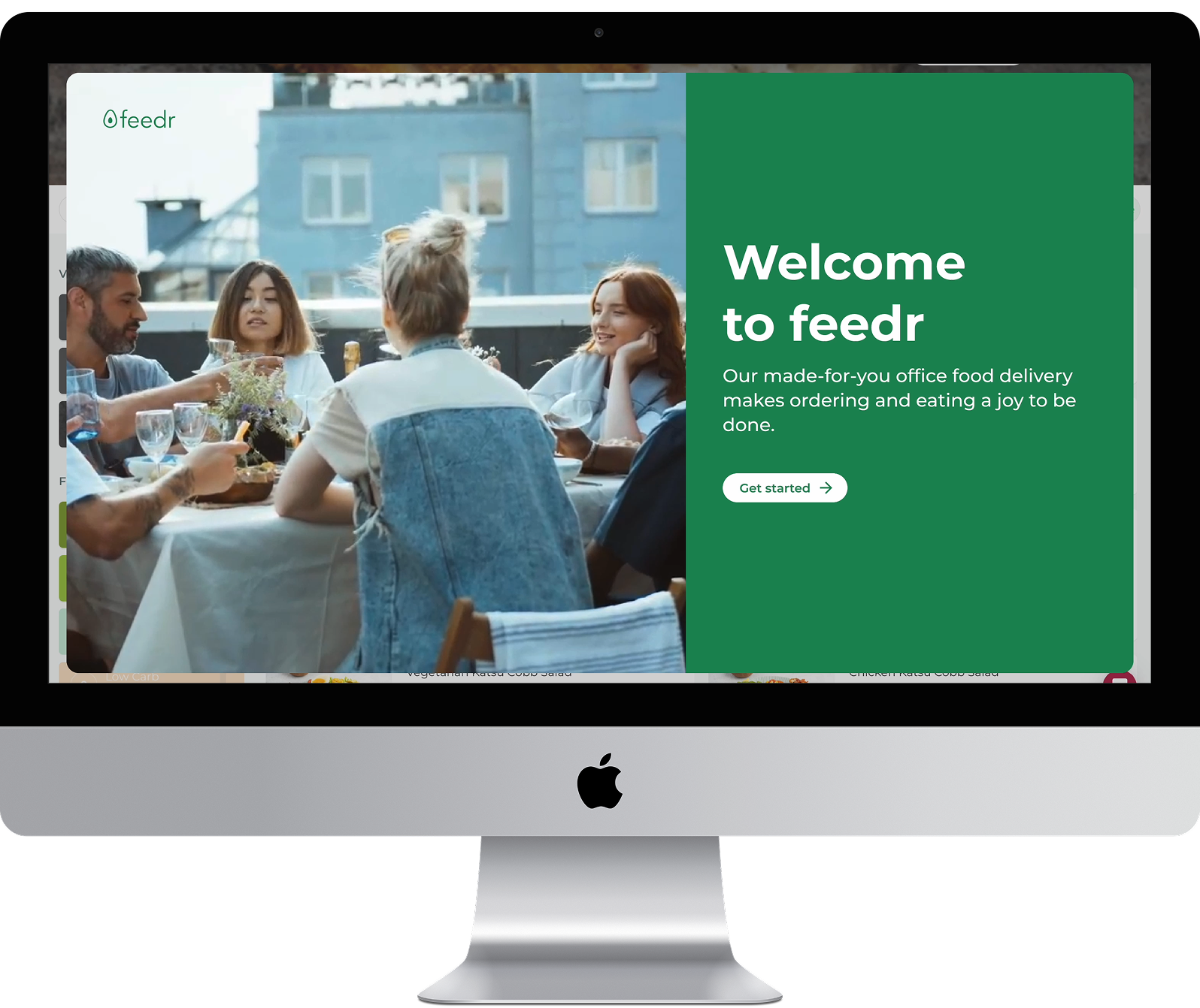
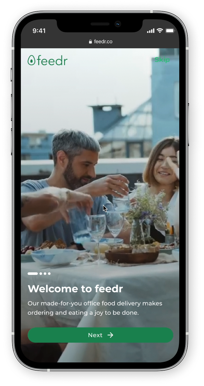
Feedr is a workplace food benefits platform. For many, onboarding is their first touchpoint; where we set expectations, build trust, and learn how to serve them. Yet the experience was anything but clear.
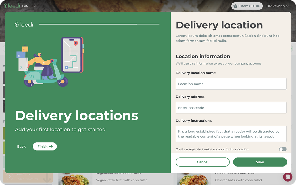
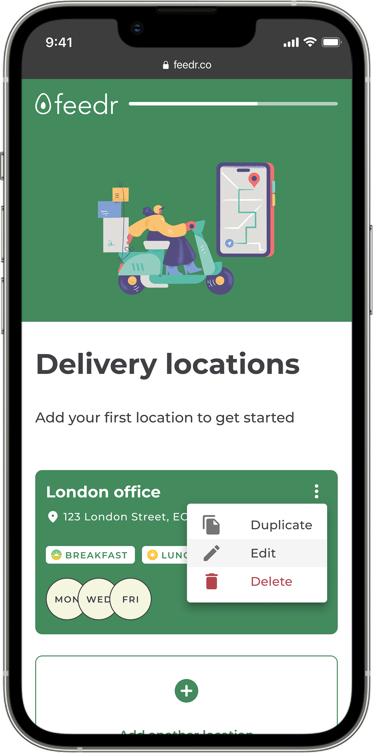
I redesigned the onboarding journey to be seamless, purposeful, and scalable for customers, and for the teams that support them.
Context
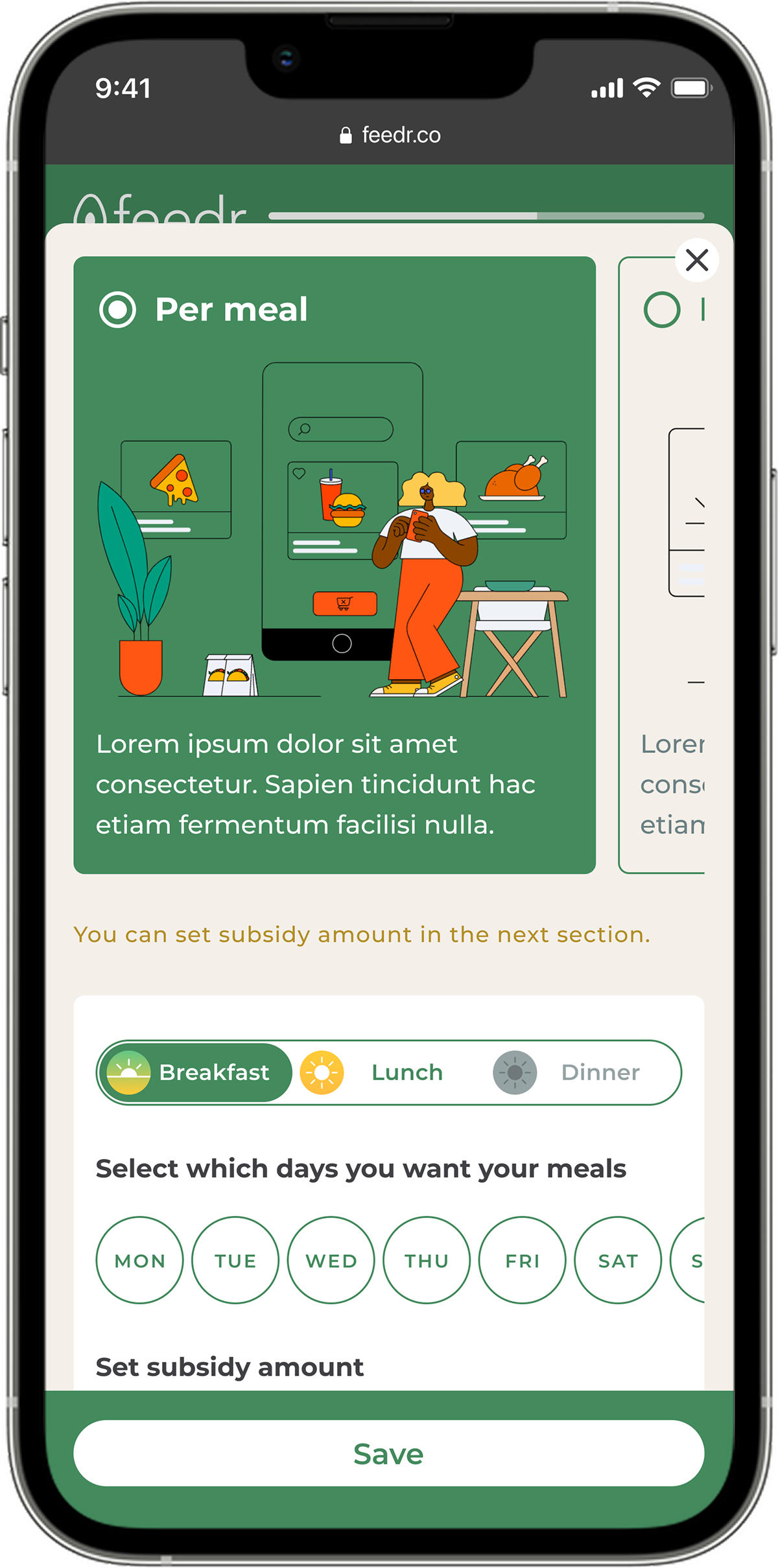
The original onboarding flow was functional but fragmented. Sales and account managers managed handovers manually. Customer data lived in silos. The UI lacked hierarchy and focus. Most of all, it failed to reflect Feedr’s promise of smart, effortless service.
My Role
As Lead Product Designer, I led discovery, strategy, and delivery.
Defined the service blueprint and product scope
Led UX and UI design across desktop and mobile
Aligned design with existing systems and future needs
Partnered with engineers to ensure accurate, accessible implementation
The challenge
The existing onboarding journey hadn’t evolved since its launch. It was cluttered, manual, and inconsistent.
High drop-off rates
Long setup times
Internal misalignment between Sales and Account Managers
Poor reflection of Feedr’s promise of a tech-enabled experience
Approach
We began by conducting stakeholder interviews with sales teams, account managers, and product leads. We mapped the current flow, identified friction, and reframed onboarding as a shared system.
Our goal was to reduce noise, surface value, and create a journey that feels simple because it’s smart.
Design Principles
Clarity over complexity
Writing for websites is both simple and complex. On the one hand, all you need to do is say what you mean and in your words.

One source of truth
We integrated Hubspot and Internal Admin to align data and remove repetition.

Narrative structure
Information is revealed progressively. Key decisions happen at the right moment, not all at once.

Built for scale
The new system works for now and for what comes next.
Impact
A unified onboarding flow, from trial to setup
4x reduction in manual setup time for Sales
A modular foundation for end-user onboarding and automation
Increased completion and conversion rates
Design is not decoration. It is infrastructure.
This project reminded us that every interface is also an interface between people– customers, colleagues, systems. When designed with care, even the smallest screen can shift how a business works.
Feedr
2022, 2023
Customer onboarding
Feedr is a workplace food benefits platform. For many, onboarding is their first touchpoint; where we set expectations, build trust, and learn how to serve them. Yet the experience was anything but clear.
I redesigned the onboarding journey to be seamless, purposeful, and scalable for customers, and for the teams that support them.
Context
The original onboarding flow was functional but fragmented. Sales and account managers managed handovers manually. Customer data lived in silos. The UI lacked hierarchy and focus. Most of all, it failed to reflect Feedr’s promise of smart, effortless service.
My Role
As Lead Product Designer, I led discovery, strategy, and delivery.
Defined the service blueprint and product scope
Led UX and UI design across desktop and mobile
Aligned design with existing systems and future needs
Partnered with engineers to ensure accurate, accessible implementation
The challenge
The existing onboarding journey hadn’t evolved since its launch. It was cluttered, manual, and inconsistent.
High drop-off rates
Long setup times
Internal misalignment between Sales and Account Managers
Poor reflection of Feedr’s promise of a tech-enabled experience
Approach
We began by conducting stakeholder interviews with sales teams, account managers, and product leads. We mapped the current flow, identified friction, and reframed onboarding as a shared system.
Our goal was to reduce noise, surface value, and create a journey that feels simple because it’s smart.
Design Principles
Clarity over complexity
Writing for websites is both simple and complex. On the one hand, all you need to do is say what you mean and in your words.
One source of truth
We integrated Hubspot and Internal Admin to align data and remove repetition.
Narrative structure
Information is revealed progressively. Key decisions happen at the right moment, not all at once.
Built for scale
The new system works for now and for what comes next.
Impact
A unified onboarding flow, from trial to setup
4x reduction in manual setup time for Sales
A modular foundation for end-user onboarding and automation
Increased completion and conversion rates
Design is not decoration. It is infrastructure.
This project reminded us that every interface is also an interface between people– customers, colleagues, systems. When designed with care, even the smallest screen can shift how a business works.
Feedr
2022, 2023
Customer onboarding
Feedr is a workplace food benefits platform. For many, onboarding is their first touchpoint; where we set expectations, build trust, and learn how to serve them. Yet the experience was anything but clear.
I redesigned the onboarding journey to be seamless, purposeful, and scalable for customers, and for the teams that support them.
Context
The original onboarding flow was functional but fragmented. Sales and account managers managed handovers manually. Customer data lived in silos. The UI lacked hierarchy and focus. Most of all, it failed to reflect Feedr’s promise of smart, effortless service.
My Role
As Lead Product Designer, I led discovery, strategy, and delivery.
Facilitated stakeholder interviews and workshops
Defined the service blueprint and product scope
Led UX and UI design across desktop and mobile
Aligned design with existing systems and future needs
Partnered with engineers to ensure accurate, accessible implementation
The challenge
The existing onboarding journey hadn’t evolved since its launch. It was cluttered, manual, and inconsistent.
High drop-off rates
Long setup times
Internal misalignment between Sales and Account Managers
Poor reflection of Feedr’s promise of a tech-enabled experience
Approach
We began by conducting stakeholder interviews with sales teams, account managers, and product leads. We mapped the current flow, identified friction, and reframed onboarding as a shared system.
Our goal was to reduce noise, surface value, and create a journey that feels simple because it’s smart.
Design Principles
Clarity over complexity
Writing for websites is both simple and complex. On the one hand, all you need to do is say what you mean and in your words.
One source of truth
We integrated Hubspot and Internal Admin to align data and remove repetition.
Narrative structure
Information is revealed progressively. Key decisions happen at the right moment, not all at once.
Built for scale
The new system works for now and for what comes next.
Impact
A unified onboarding flow, from trial to setup
4x reduction in manual setup time for Sales
A modular foundation for end-user onboarding and automation
Increased completion and conversion rates
Design is not decoration. It is infrastructure.
This project reminded us that every interface is also an interface between people– customers, colleagues, systems. When designed with care, even the smallest screen can shift how a business works.